Enhancing ease and efficiency in purchasing home or office items, driving increased sales and revenue growth.
Let's set the scene...
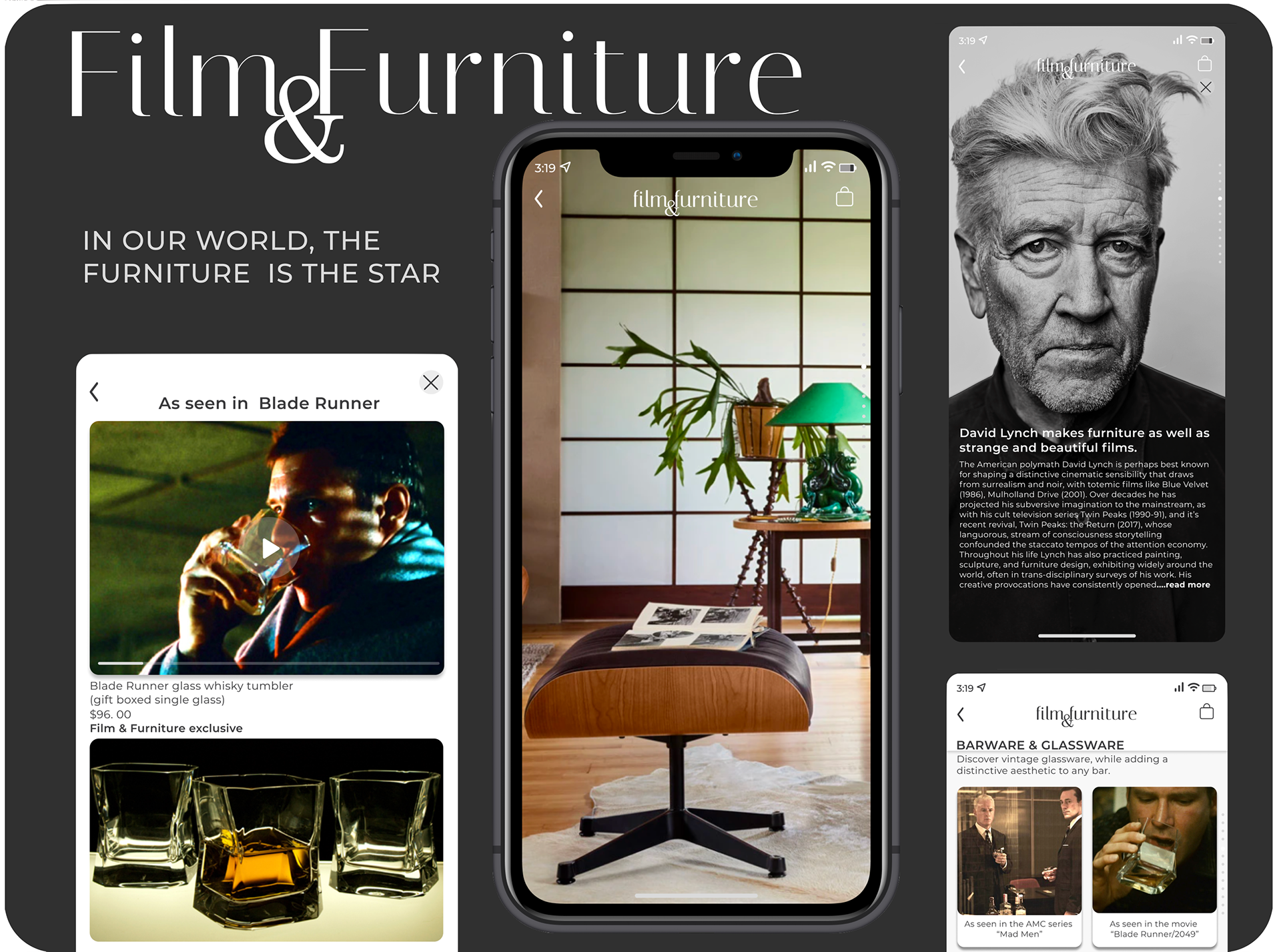
Film & Furniture, based in the UK, is an online curated shopping experience. They sell hard-to-find items from movies and television. Detailed product information and the VR feature significantly boosted user confidence and engagement rates.
I would like to...
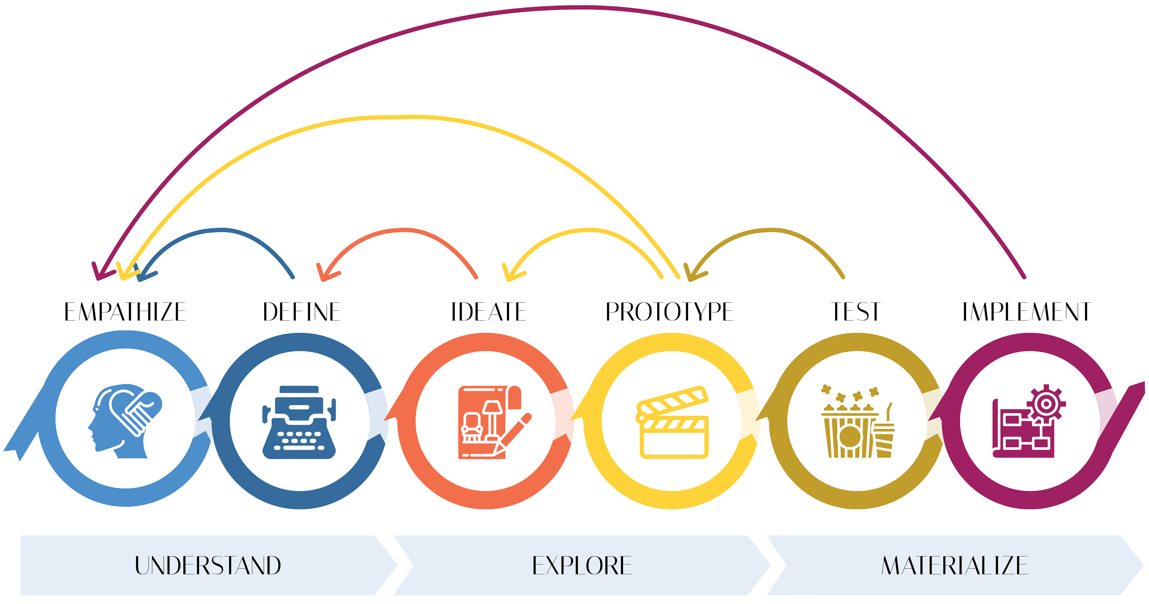
Based on a comprehensive analysis, user research, and market data, stakeholders aligned on prioritizing product information and reviews. I worked with stakeholders to keep the scope focused while addressing the business needs and pain points. Usability testing validated the critical need for virtual reality (VR) product visualization.
Business needs & persona
“There are no dimensions, but after looking at the table in a room on the site, I’m guessing it will fit in my living room.”
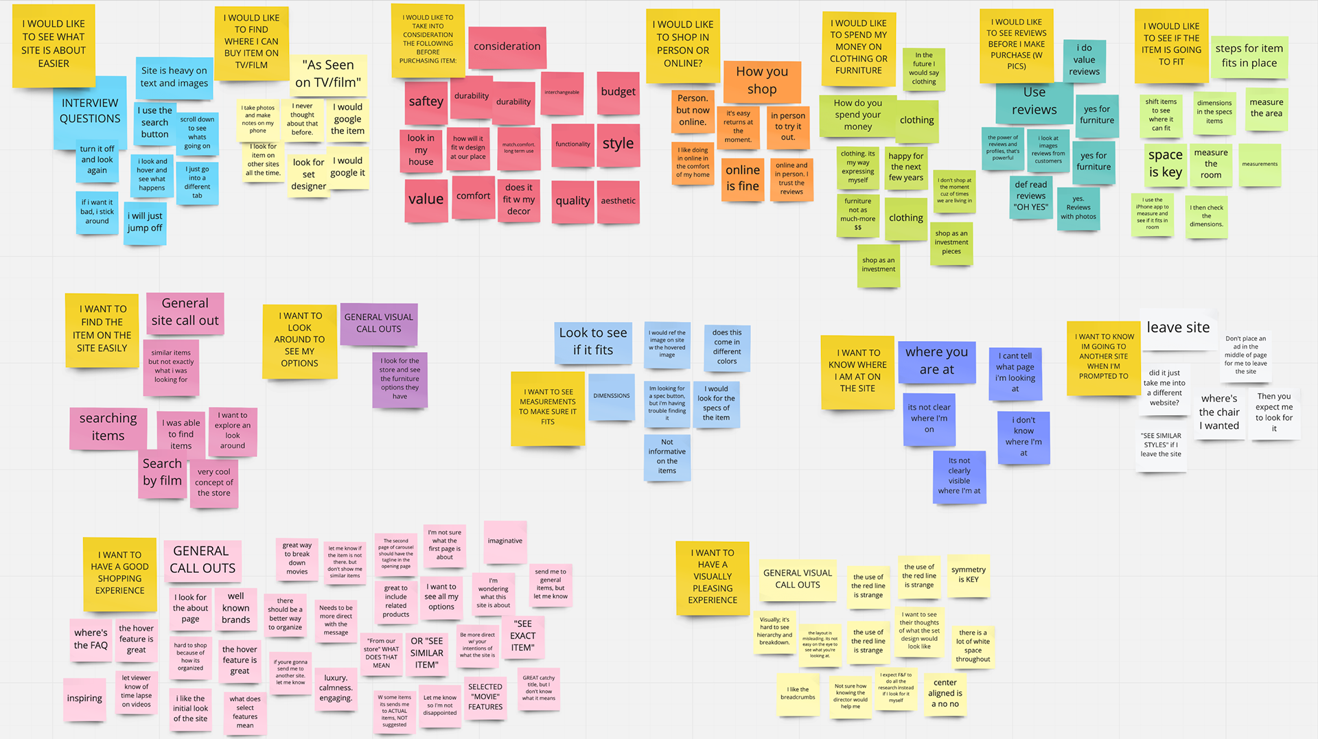
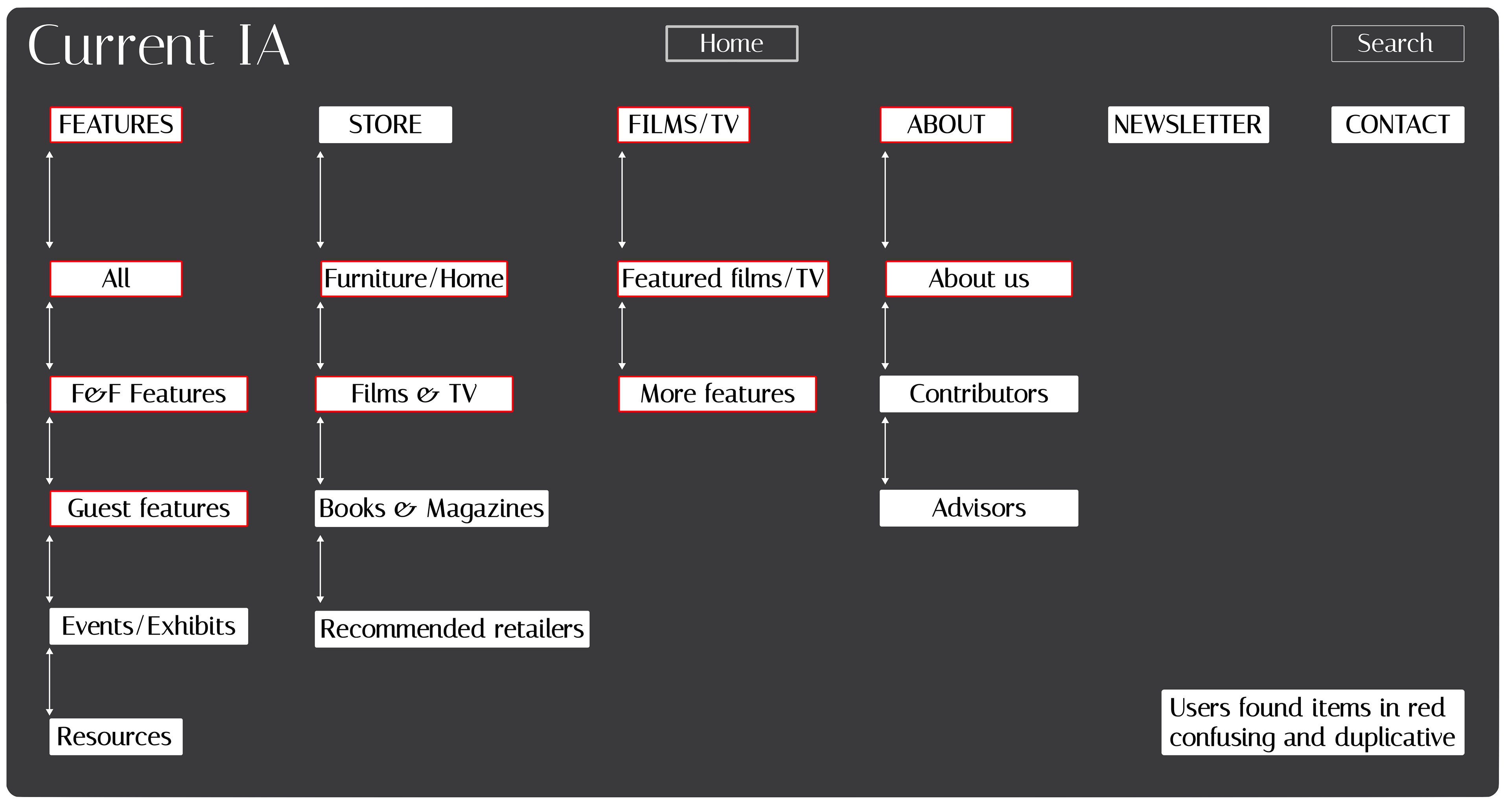
The shopping experience declined significantly. Poor site navigation, lack of essential product information, and customer reviews compromised the user experience, directly impacting sales potential.

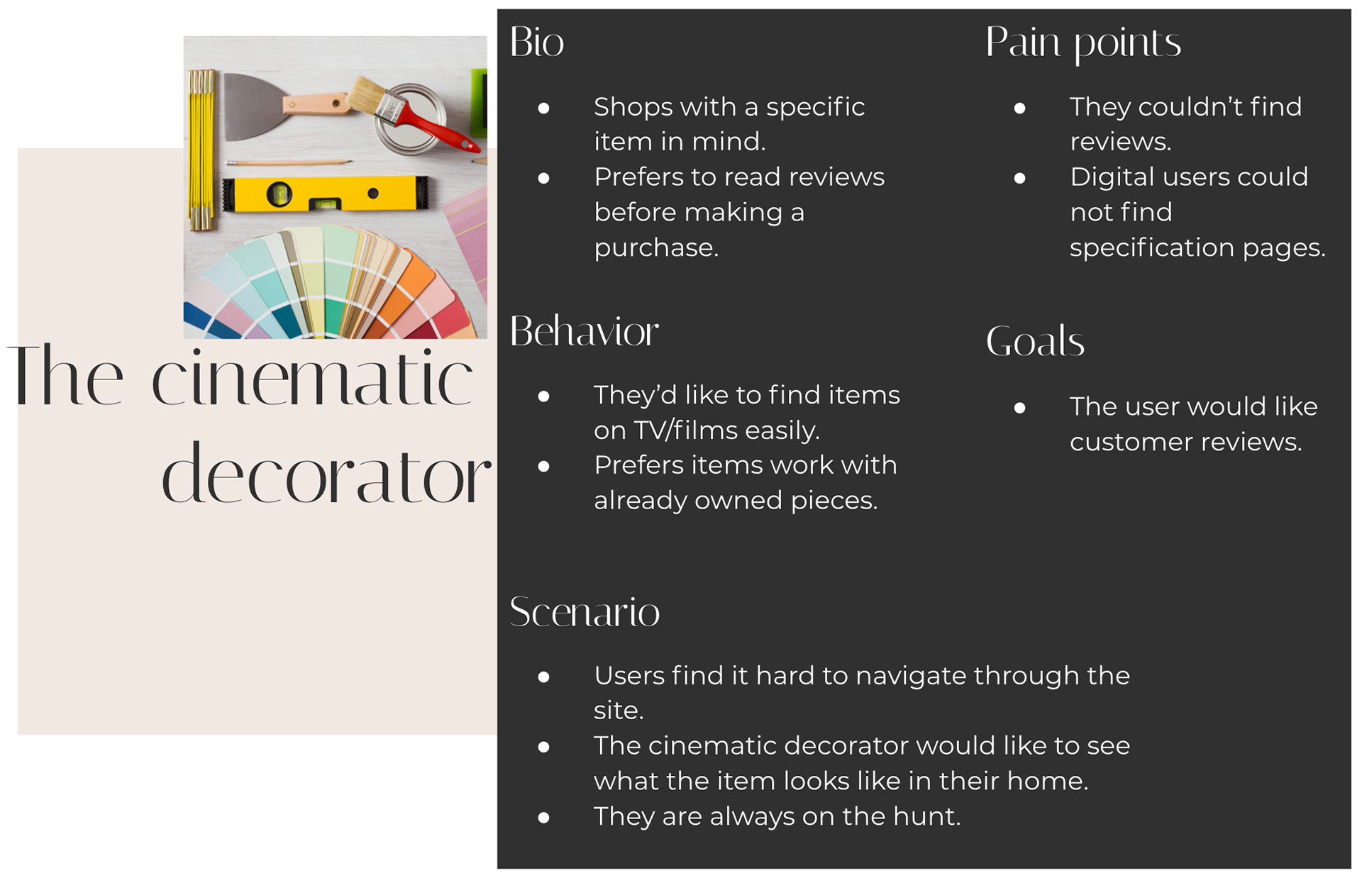
The target persona: the cinematic decorator - design enthusiasts who draw inspiration from film and TV. They prioritize evaluating how furniture pieces will integrate into their existing spaces.
After evaluating, the results are in...
“Only because I just started, can I tell that I’m on the first page, but it's not visible.”
Usability testing revealed barriers to completing a purchase. Two key issues significantly impacted user confidence and purchase intent:
• The absence of clear navigation-preventing users from efficiently browsing, resulting in frustrated customer experience and incomplete shopping (1)
• Limited product information- leaving users without crucial information needed to make purchase decisions, directly affecting conversion rates (2)

That Cinematic Decorator
“I search for measurements to confirm it will fit in my place. I also look at reviews, with pictures.”
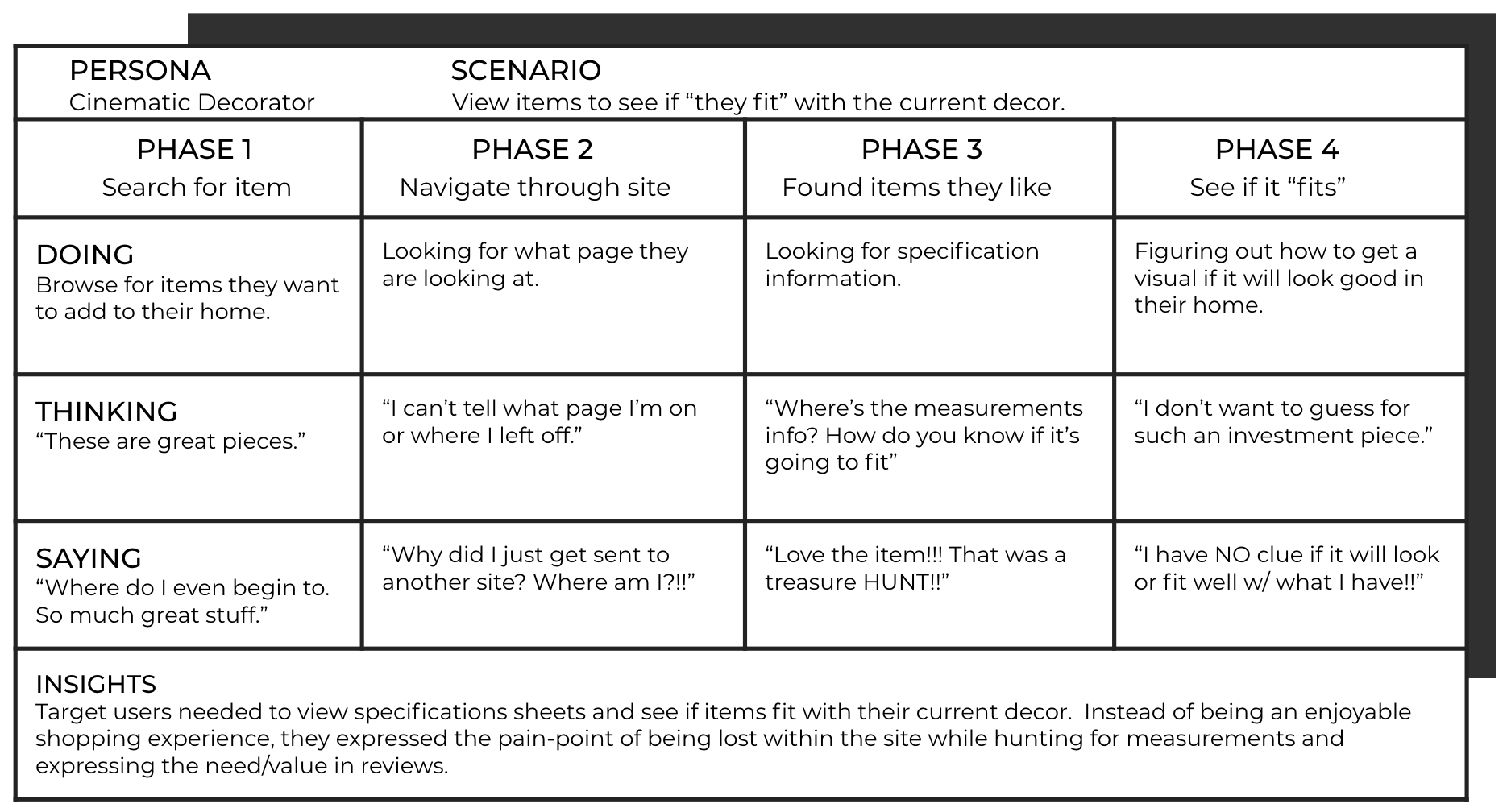
A poor content organization created friction in the customer journey. The cinematic decorator struggled to navigate through dense, complicated product discovery, causing users to abandon their search.
Let me take you on a journey
Customer research revealed revenue loss due to inadequate product presentation. The users abandoned their purchase due to two critical gaps: insufficient product specifications and a lack of visualization. The absence of customer reviews undermined purchase confidence. These issues directly impacted conversion rates.
Competitive
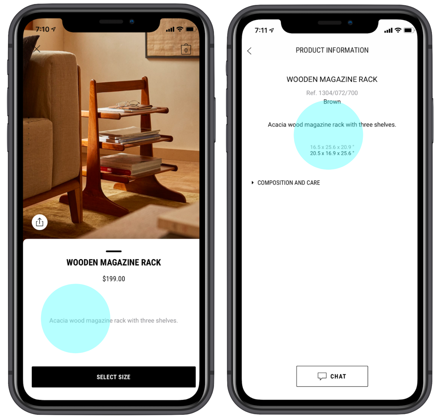
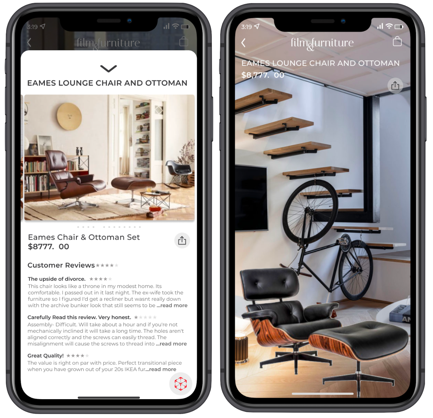
Zara Home exemplifies effective design through the information displayed. The dual-panel approach balances immediate price visibility with detailed product specifications, enabling informed purchase decisions.
Comparative
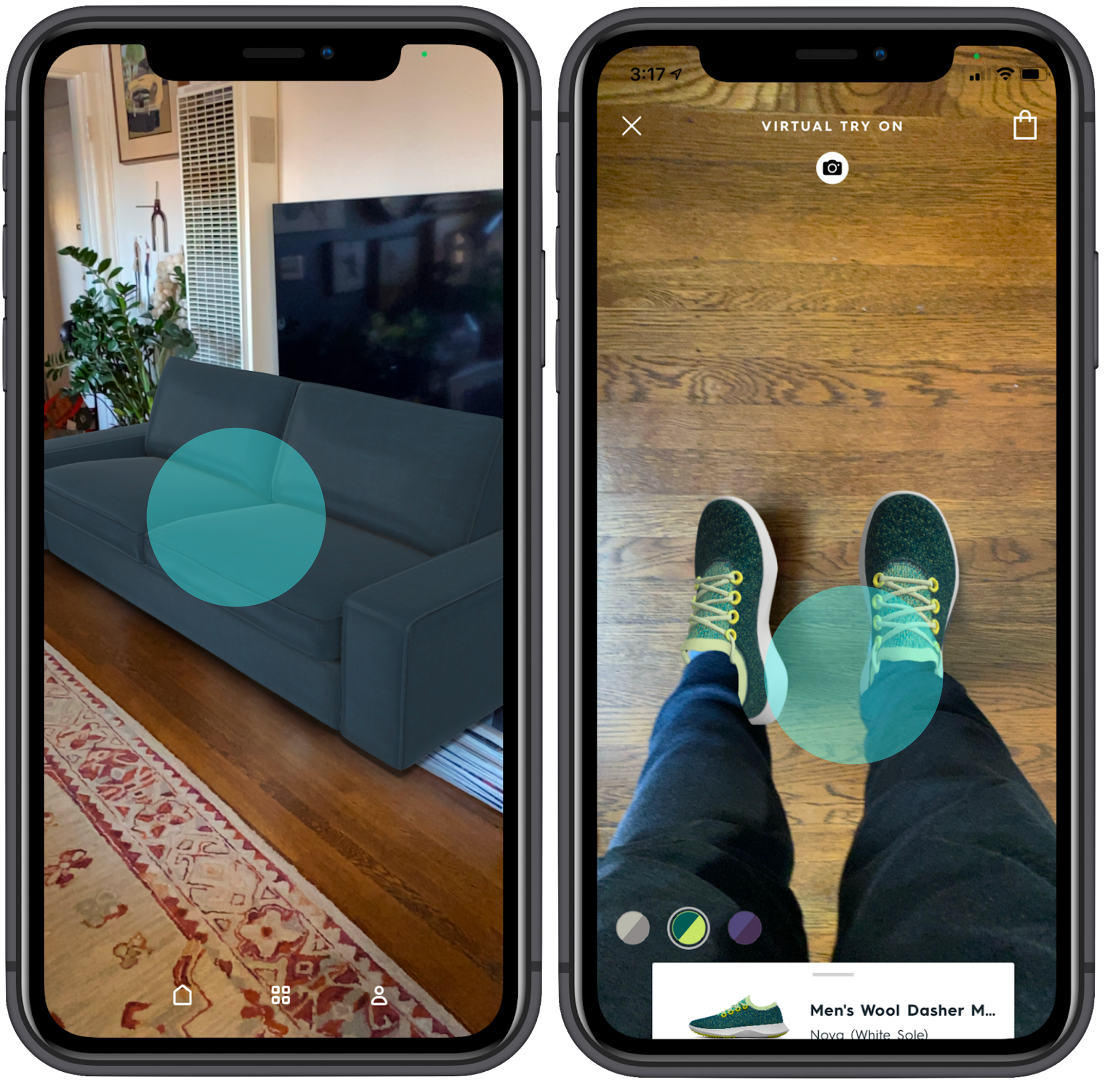
Allbirds and IKEA leverage VR technology to drive purchase confidence - IKEA through virtual furniture placement, and Allbirds through virtual shoe try-ons. Both solutions address uncertainty, a key barrier to online purchases.
What seems to be the problem?
“I wanted to see measurements and product info, but I can’t find it!!”
The cinematic decorator;
• Prefers streamlined navigation with intuitive category organization to quickly locate desired film-inspired pieces
• Values clean, minimalist content that prioritizes visual information over lengthy text descriptions
• Requires VR visualization capabilities to validate how furniture pieces will integrate with their existing decor before committing to purchase


The hypothesis is telling me...
Proposed updates;
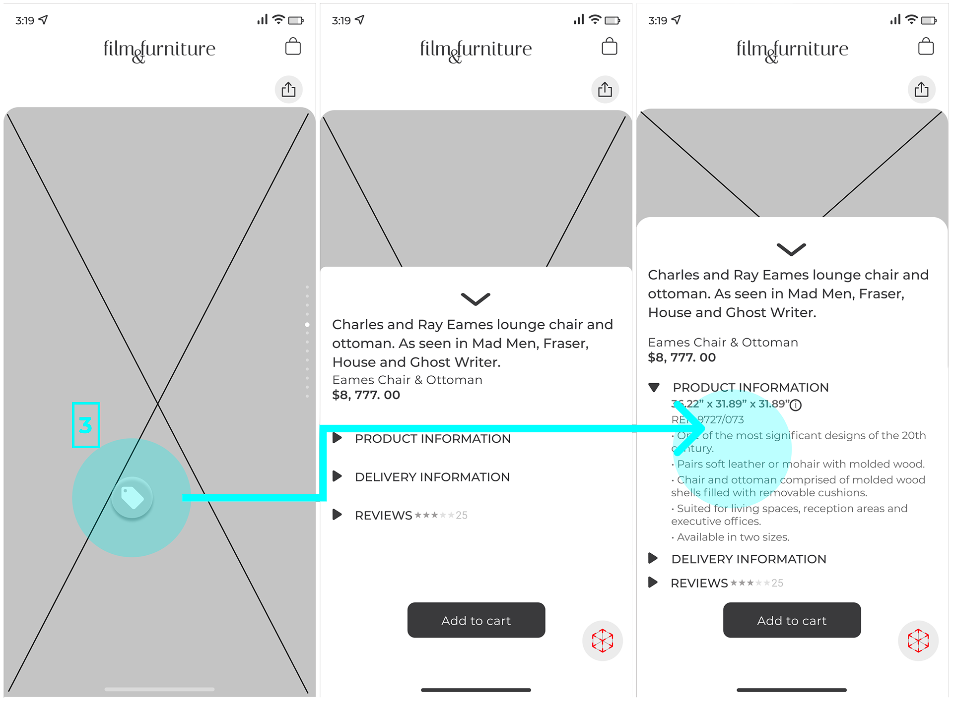
• Addressing a critical barrier that impacts abandoned purchases- by implementing customer reviews and detailed product specifications
• Enabling customers to preview furniture placement in their spaces with the integration of VR technology- a feature proven to increase purchase confidence
How's the foundation architecture?
“It’s a little hard to see what I’m shopping for because of how it's organized.”
The testing revealed critical navigation issues: redundant category structures and unclear user pathways led to disorientation during product discovery.
Let's give it an update
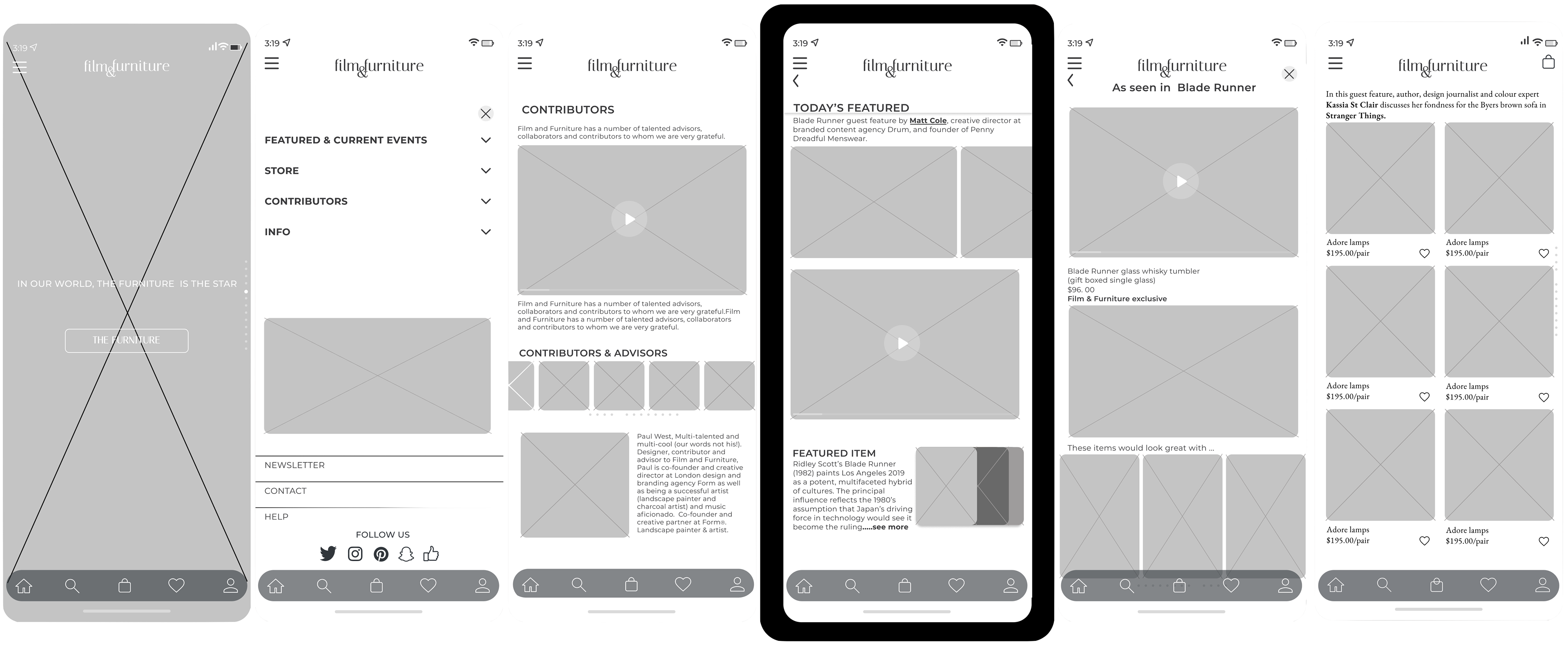
Streamlining the information architecture improved key business metrics. Consolidating product categories and simplifying the users' navigation led to measurable gains in customer engagement. This reduced cart abandonment rates and accelerated the path to purchase, directly contributing to improved conversion rates and higher order completion.

Work out your thoughts, pen to paper
By creating an mapping and resolving critical pain points, users experience a more seamless journey.
The user's enhancement provided clear visibility into conversion barriers and necessary refinements, resulting in accelerated purchase completion rates.
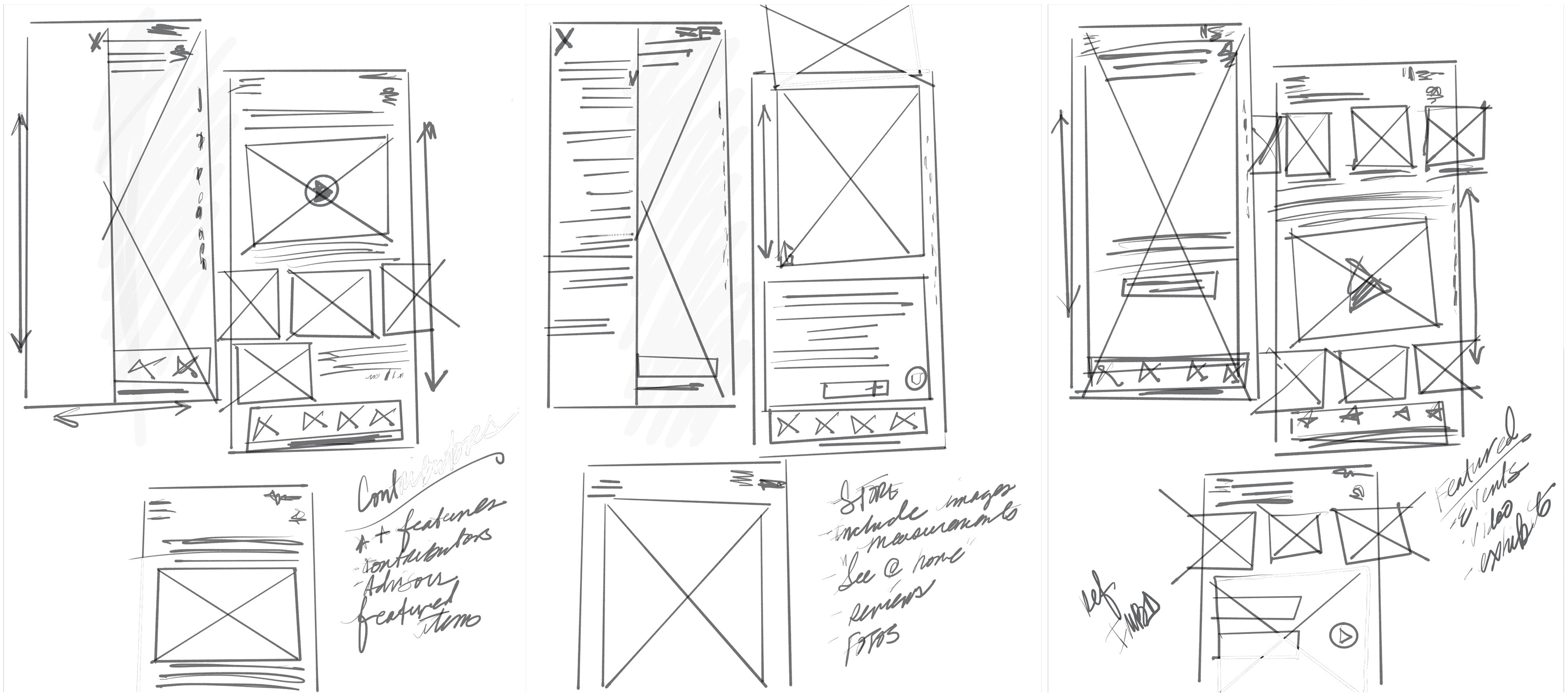
Low-level wireframes
Iterate before committing to wireframes
Early-stage discovery and wireframe validation proved crucial for efficiency, which led to avoiding costly revisions later. This approach significantly reduced development time and resources.
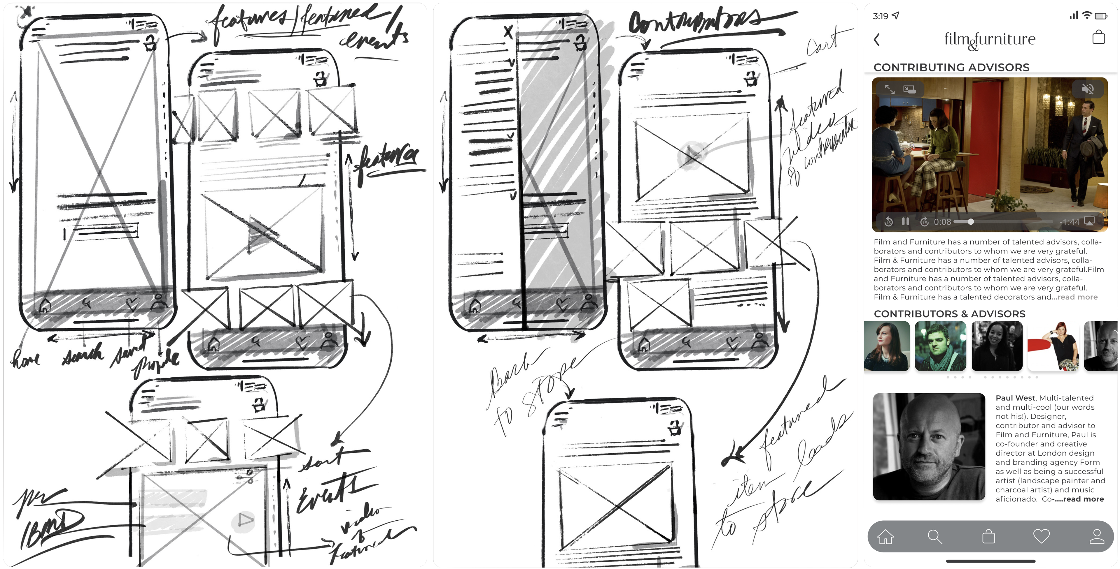
Second iteration of low/high wireframes
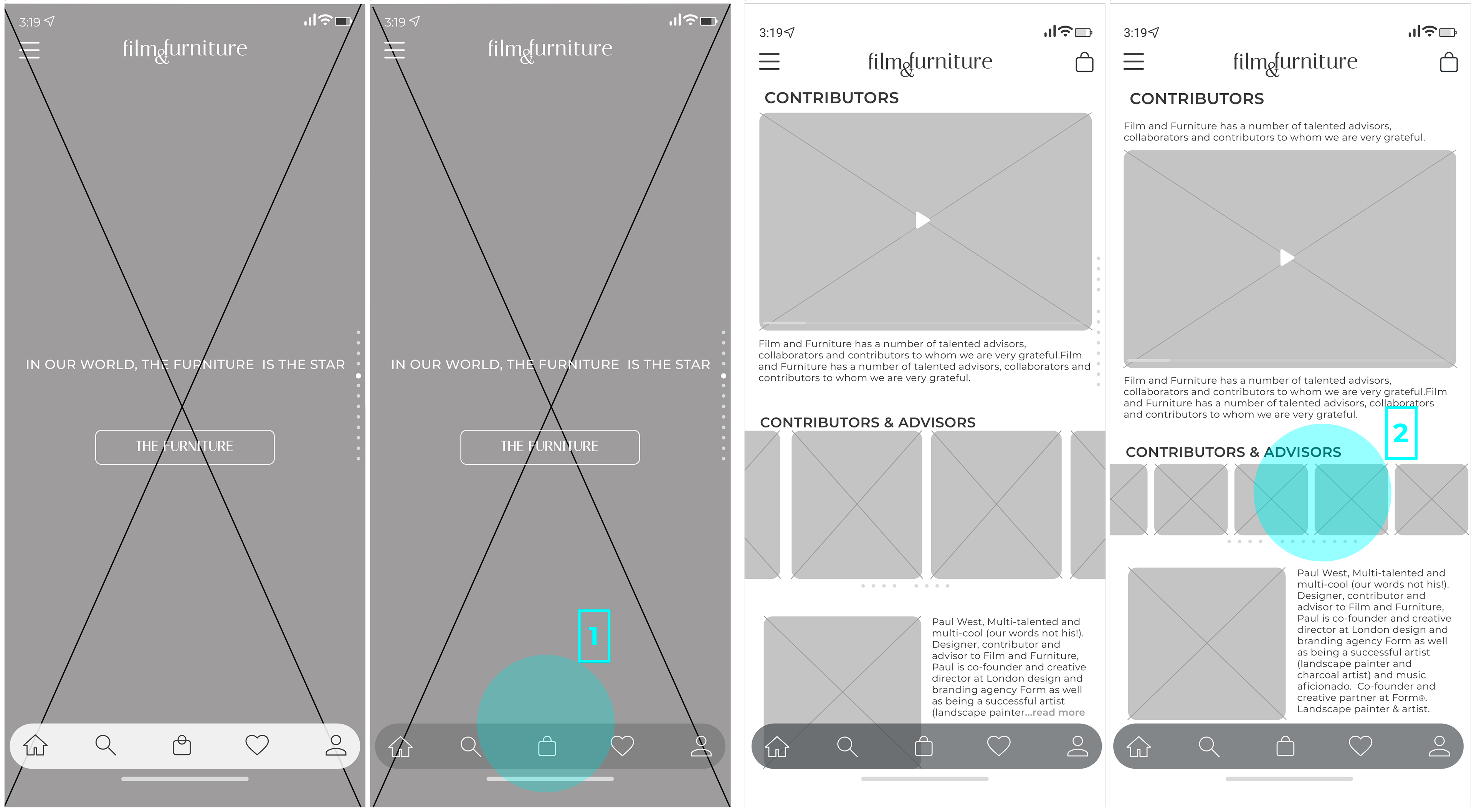
"A" better than "B"?
“The white color at the bottom looks like an afterthought.”
• Users found the bottom bar provided consistent orientation without compromising the site's visual design (1)
• Reducing thumbnail sizes created a clearer visual hierarchy, eliminating competition between elements and allowing users to focus on primary content without distraction (2)
"Let's work through the iterations and how they tested"?

(1)

(2)
(3)
"The Lonestar"
• Despite improved loading times, excessive text remained a barrier to user engagement - failing to address the core content hierarchy issue (1)
"The picture show"
• Heavy use of images violated minimalist design principles, resulting in slow performance and unclear content prioritization which confused users (2)

"The featured attraction"
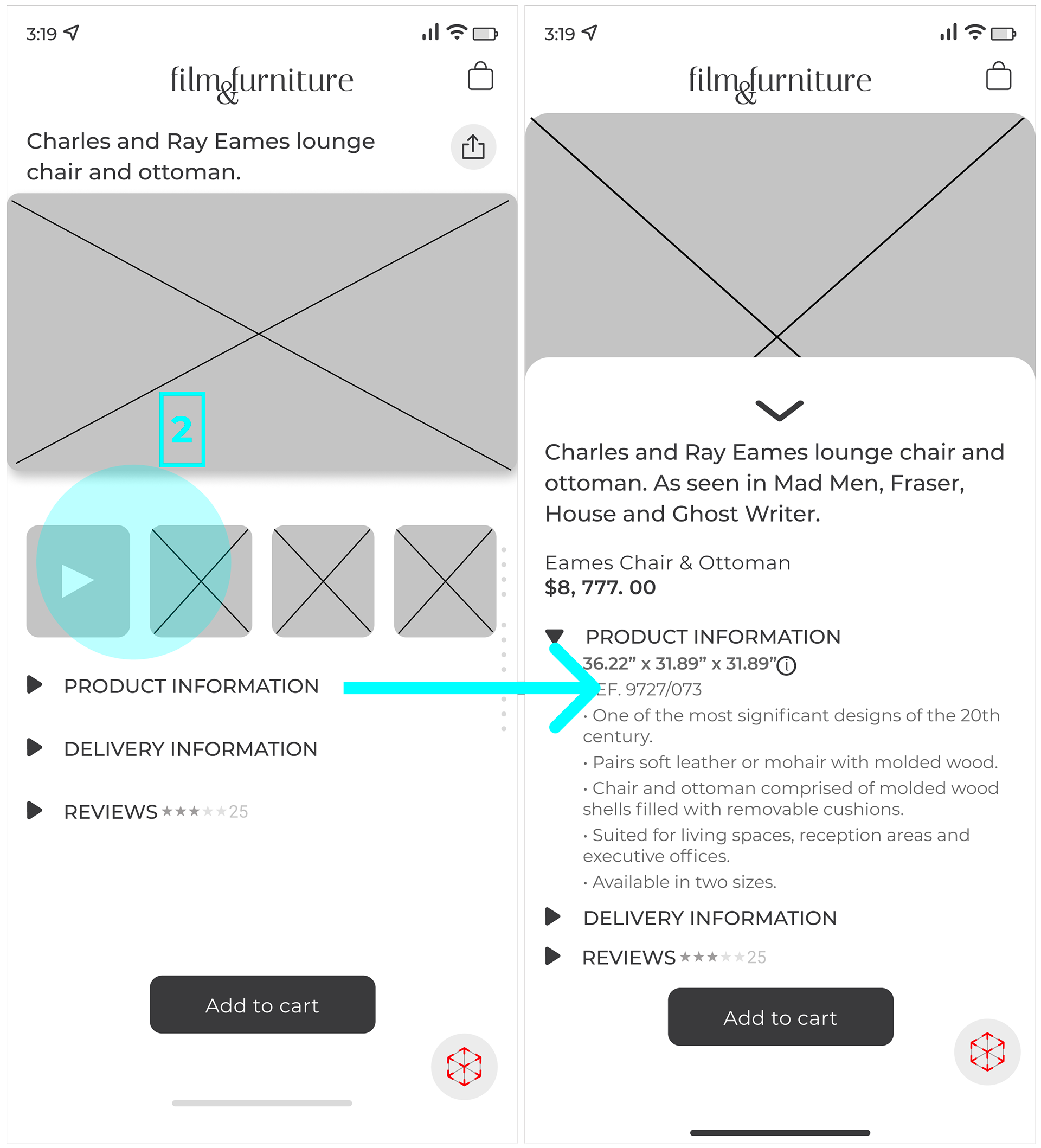
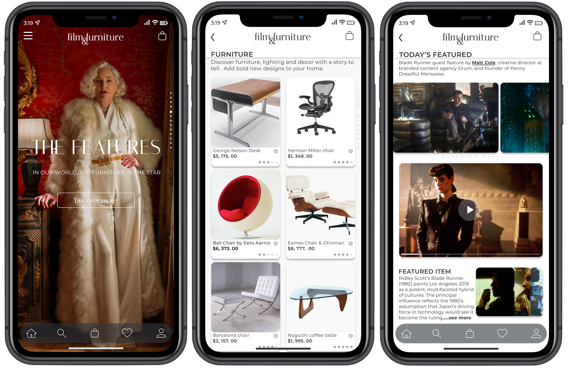
• Refining the visual hierarchy enabled users to navigate effortlessly and identify desired items more efficiently
• Product cards boosted search effectiveness and content discovery, leading to improved engagement metrics and successful product search
• Micro-interactions provided instant user feedback, creating a positive response and confidence-building shopping experience (3)
Mid-level wireframes
Certain features tested horribly;
Testing revealed conversion barriers in the UI. Multiple competing elements diminished purchase clarity, while redundant CTAs created decision paralysis. Streamlining CTAs and reducing noise, created a focused path to purchase- which improved user confidence and reduced abandonment rates.
I get the picture now
“There are still too many steps to complete this task, I feel there is a need for simplification.”
Rigorous usability testing revealed navigation issues in the prototype. Task completion rates improved and reduced user friction points by eliminating redundant screens and streamlining user flows.
The prototype, & MVP
Market research and testing identified two critical MVP features:
• The implementation of customer reviews addresses a key conversion barrier
• Comprehensive product specifications enable confident purchasing by delivering essential decision-making information
Let's reflect for a moment
Given the client's location in Europe and limited communication, I took the initiative to keep moving the project forward.
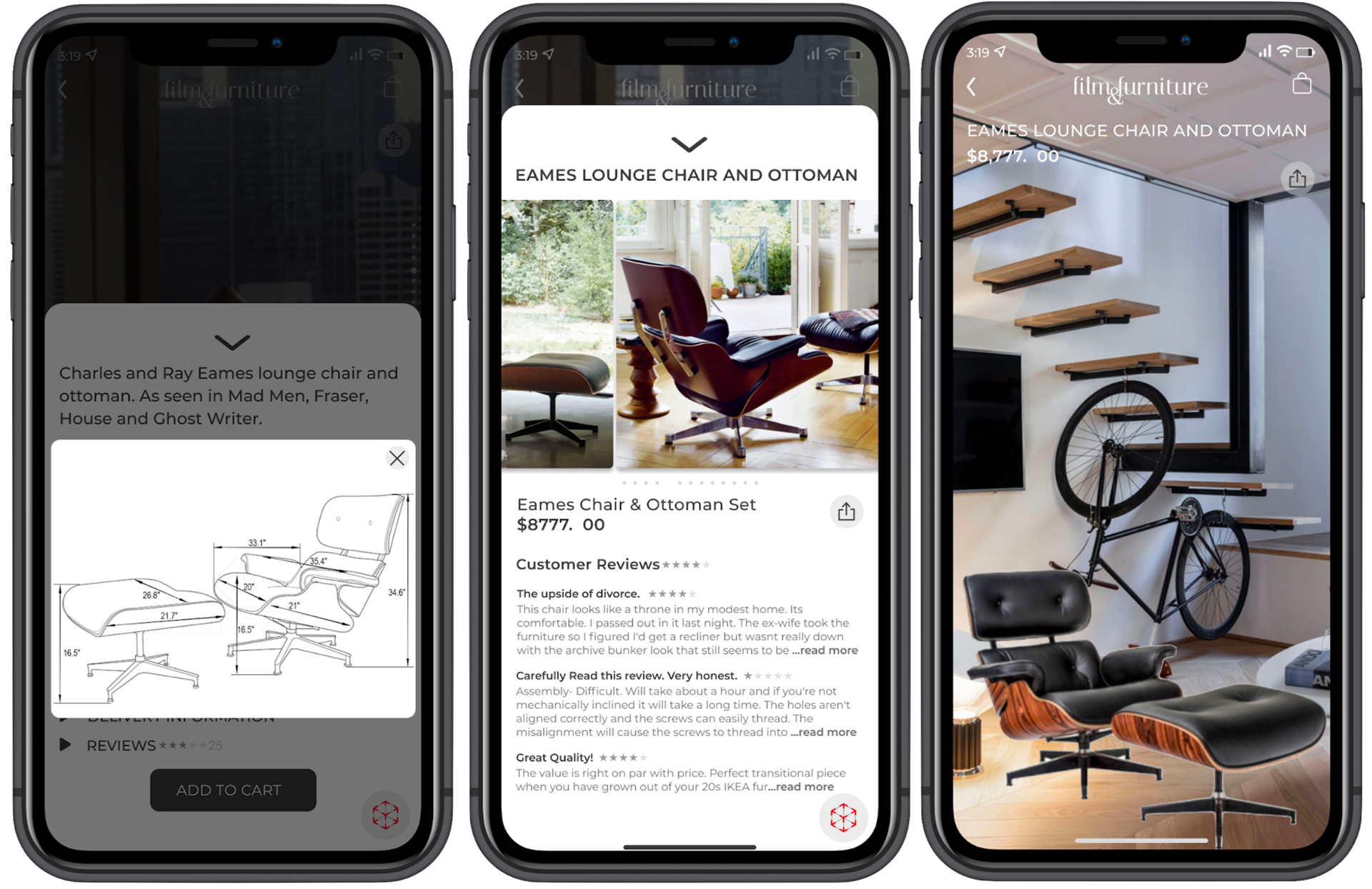
Key integrated features include:
• Customer reviews with images
• Specification page with measurements & product details
• "View in Your Space" AR feature for items in the home/office
These decisions were crucial for enhancing user experience, increasing trust, and driving conversion rates.