Community involvement through volunteer support and donations while engaging refugee support.
A quick RIT world tour...
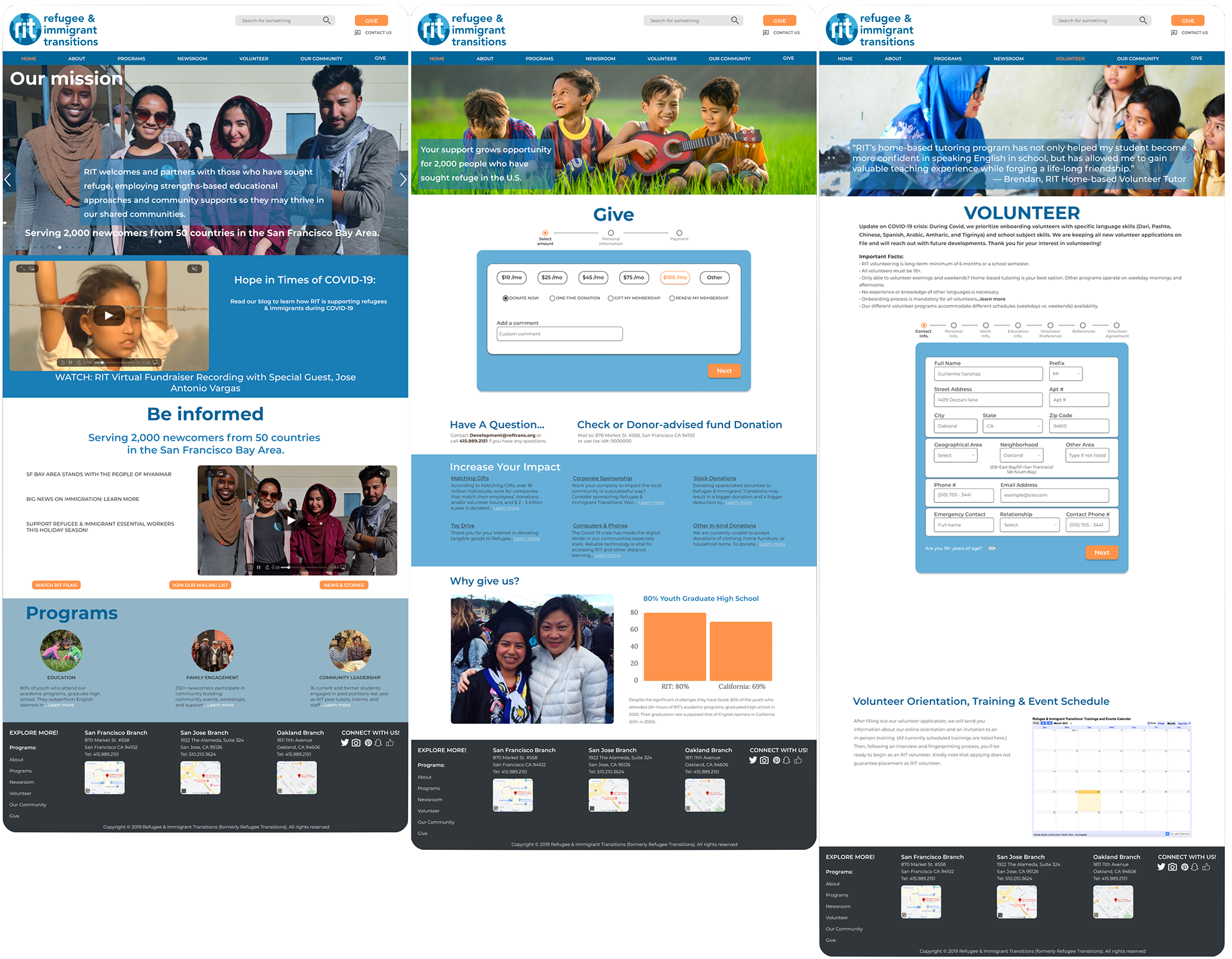
Refugee Immigration Transactions (RIT) helps refugees in the Bay Area adjust to American society, culture, and higher education, with volunteers offering support and donations.
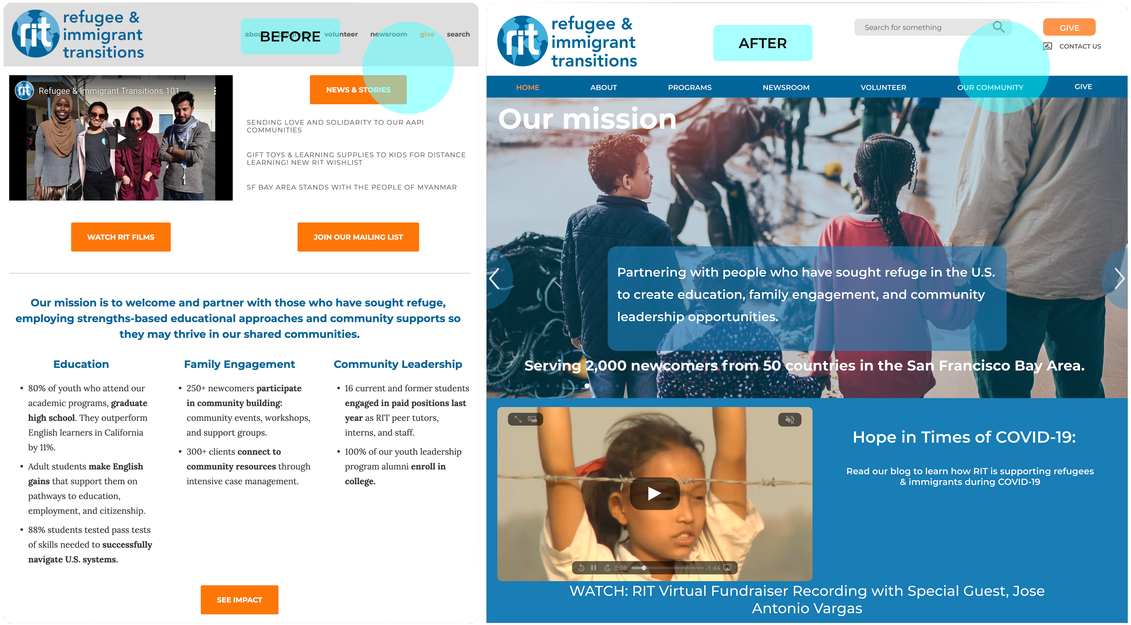
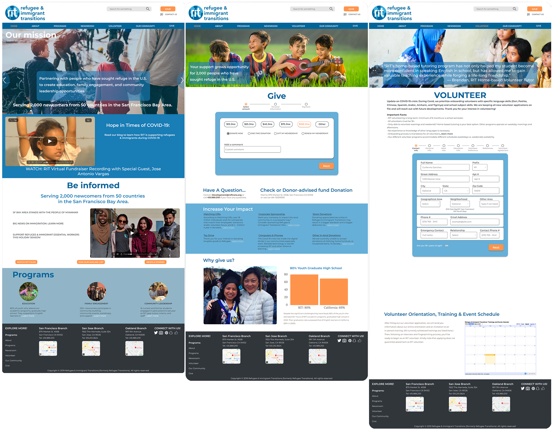
We partnered with RIT's senior communications coordinator to improve their site built on Squarespace. Working with limitations, we designed a more streamlined experience-resulting with a positive overall impact.
A quick recap of updates.
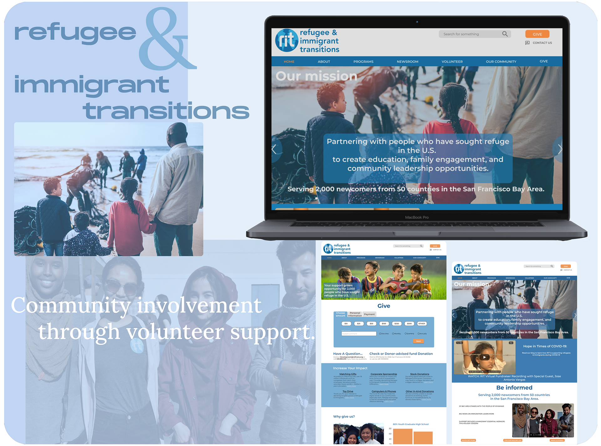
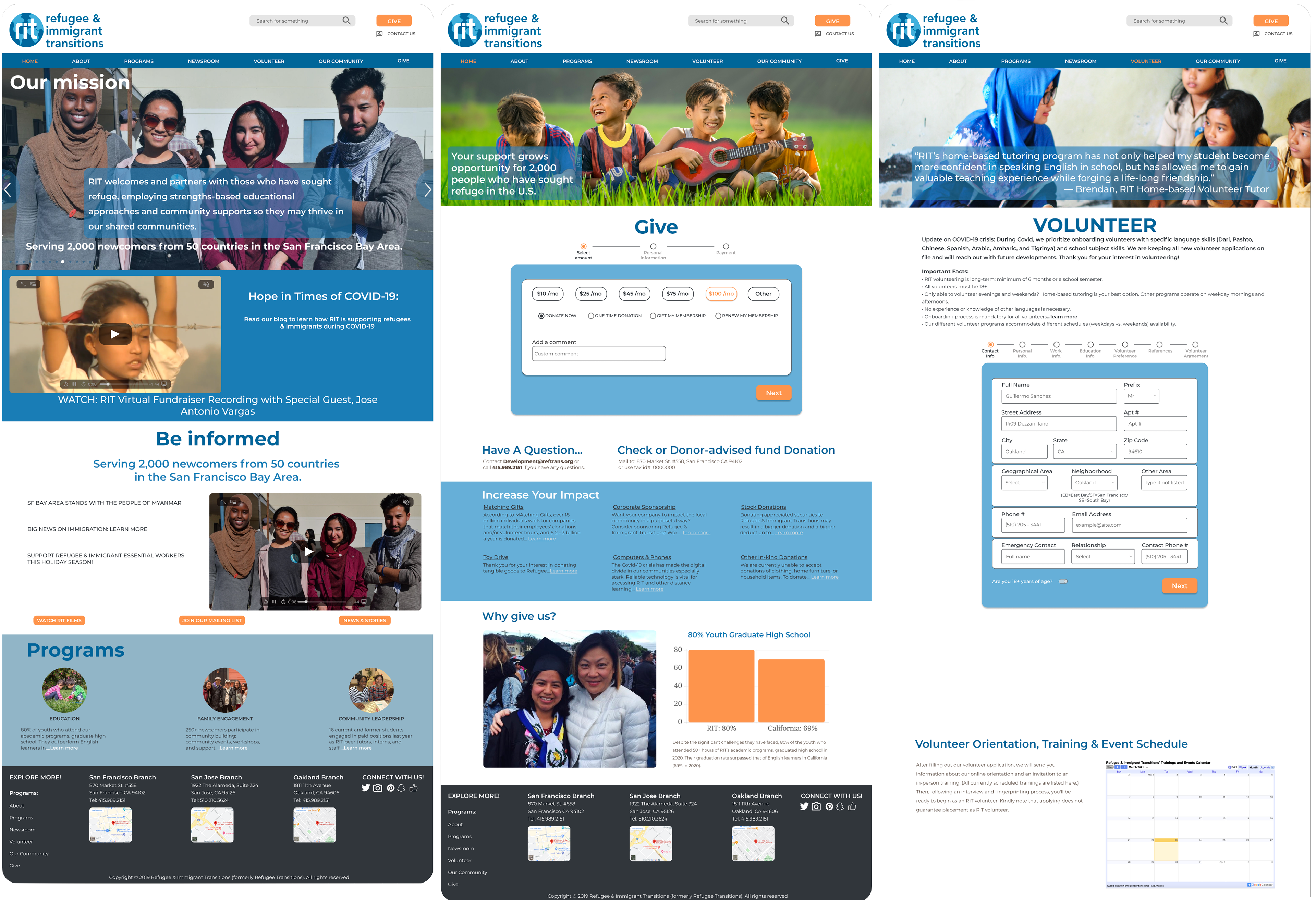
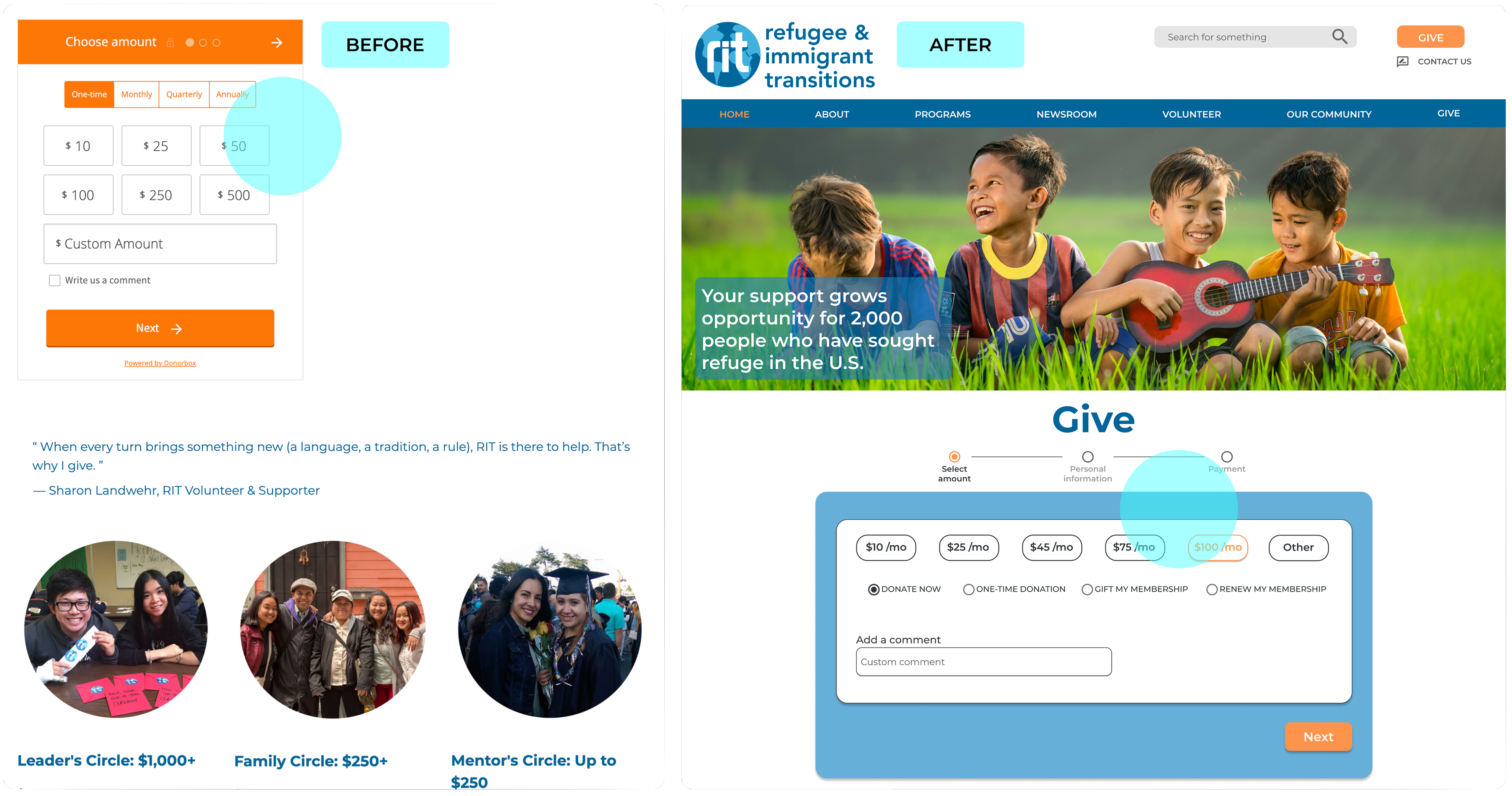
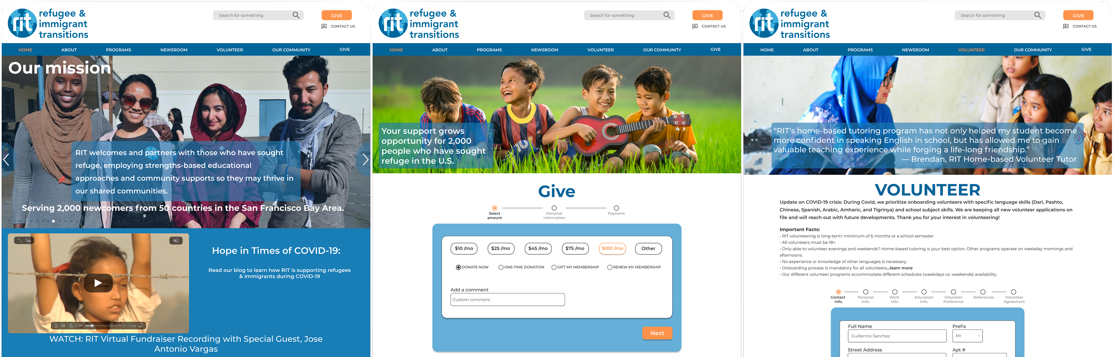
The updated landing page featured a simpler, more intuitive design. Streamlining the donation and volunteer processes, users faced fewer questions and were less overwhelmed, leading to an overall improved user experience.
Updates:
• Landing page
• Donation process
• Volunteer sign-up
Addressing the users' empathy
Conducting user interviews, card sorting, and usability testing, we identified the need to streamline the donation and volunteer sign-up process. Research revealed frustration with redundant CTA buttons and lengthy text, which impacted user pain points.
More supportive research
“I would like it to be clear and easy for me to donate.”
We identified a need for simplification. While the donation task was clear, it lacked cohesion with the rest of the brand.
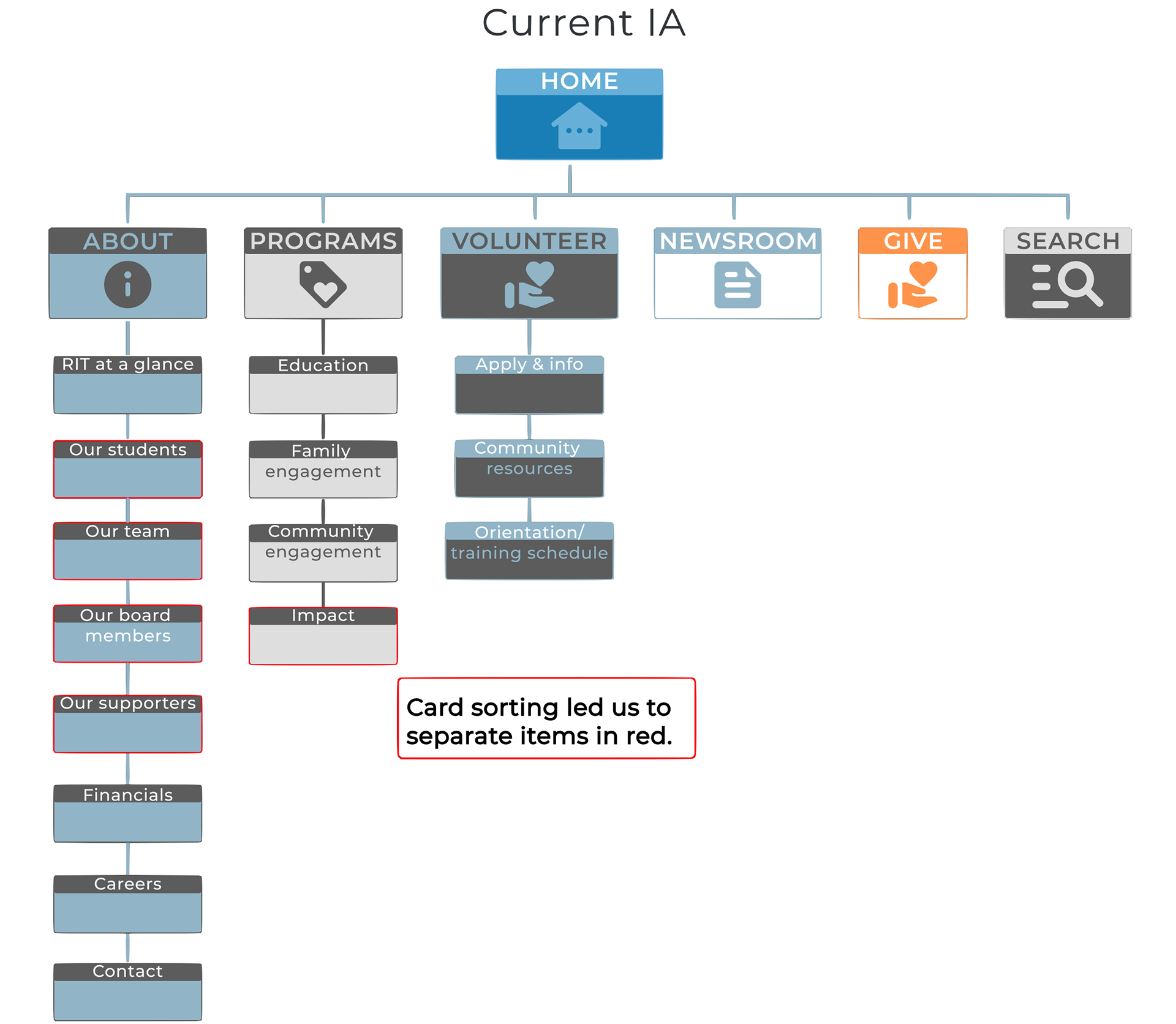
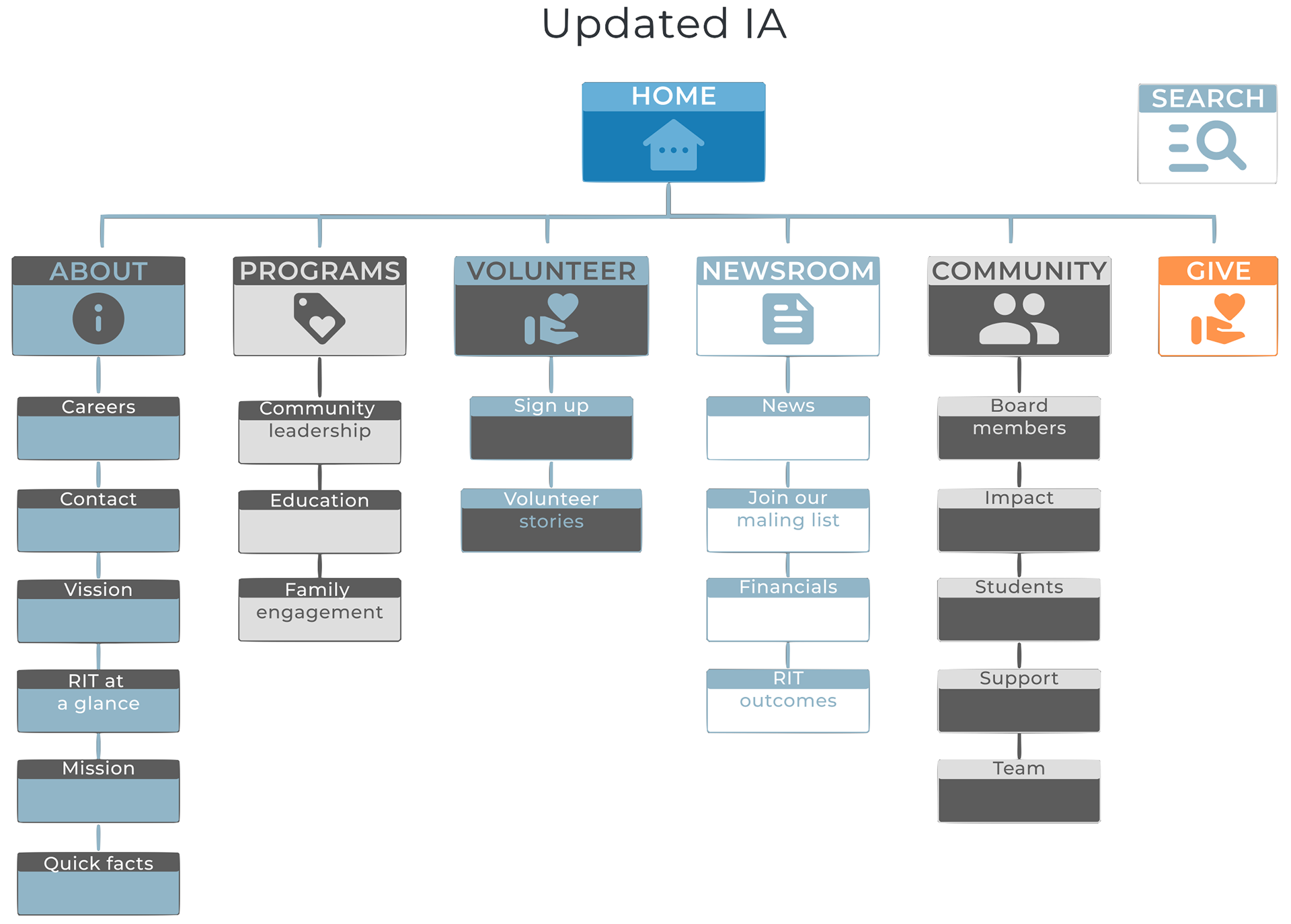
Sort it out
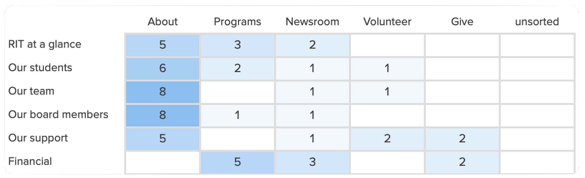
Users found duplicated and floating links overwhelming, placing focus on improving clarity. We prioritized data-informed decisions, aligning with the client’s needs. This led to more subsections and an expanded information architecture (IA).
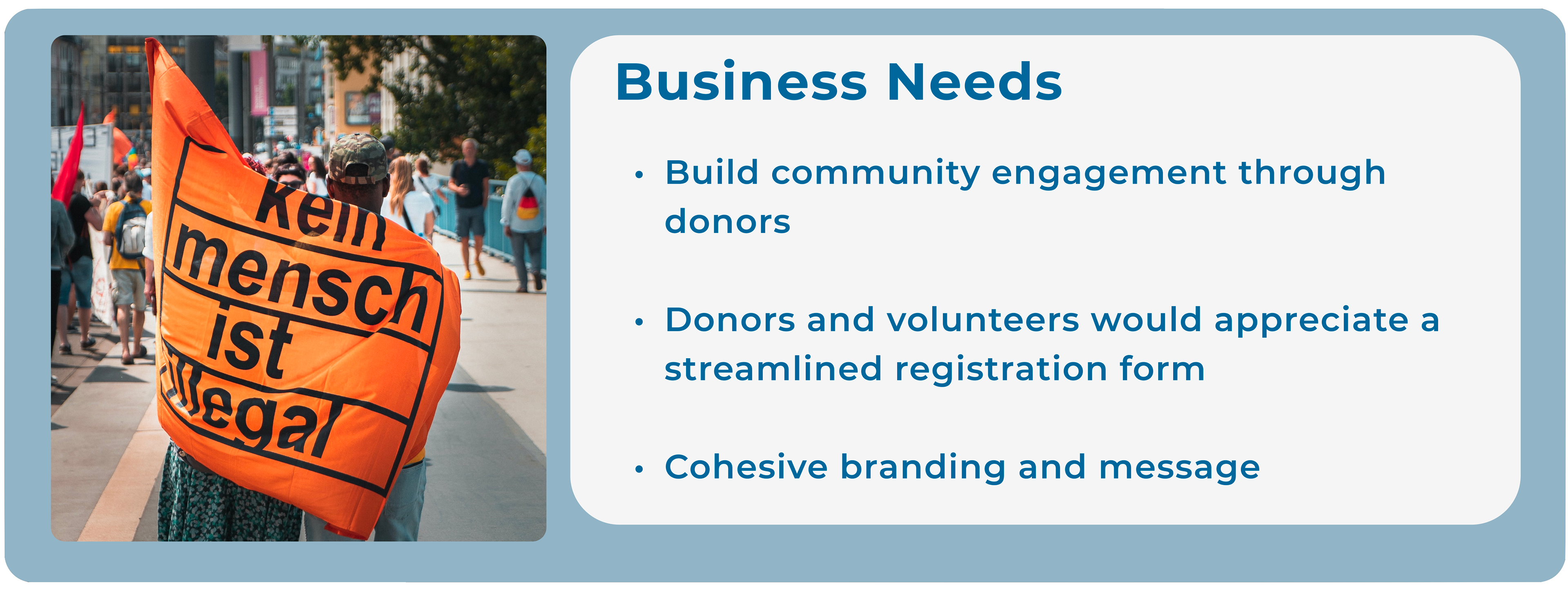
Business needs & persona
“What matters most: Privacy / Community engagement / Support”
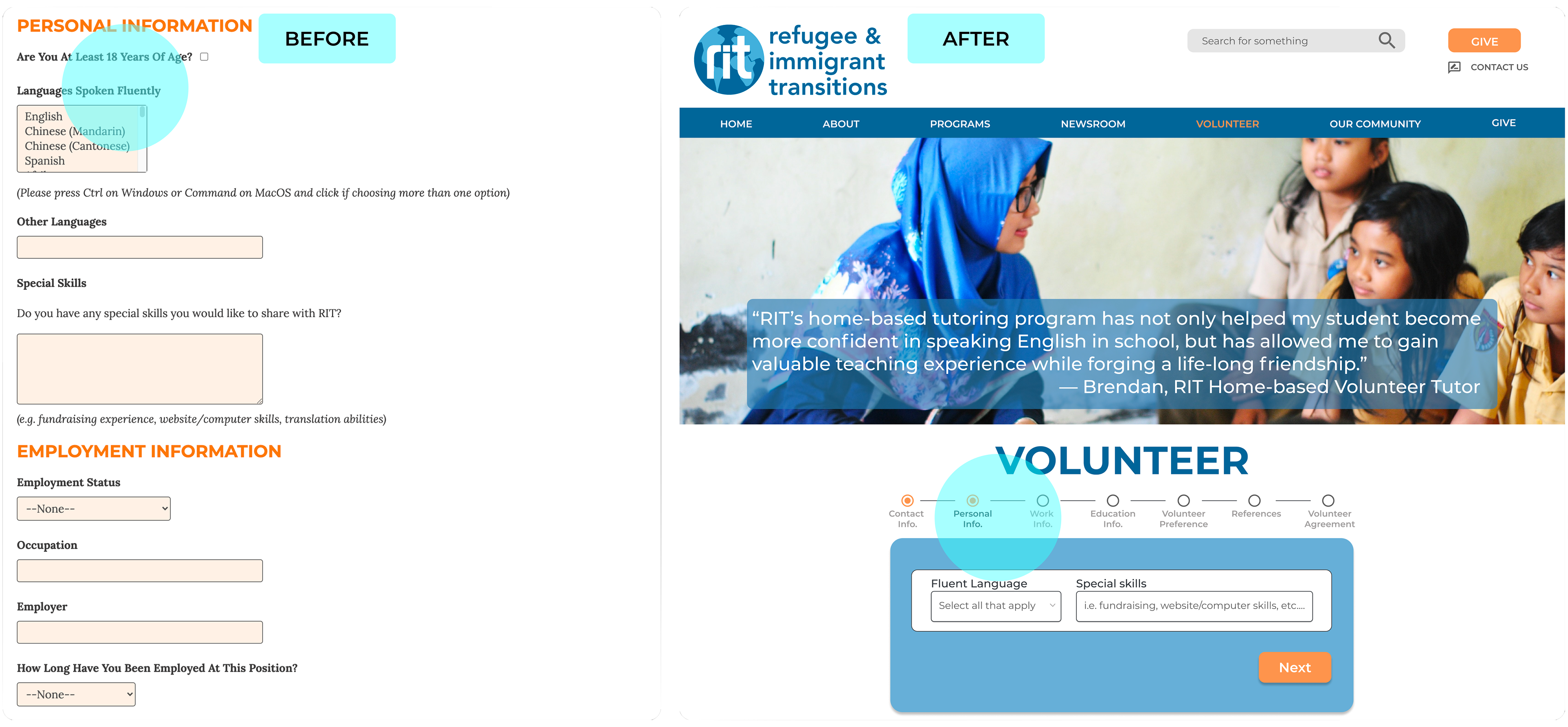
Users abandoned the site due to excessive text, images, and duplicated CTA buttons. While the questions in the forms were essential, volunteers preferred a more streamlined approach. The donation process needed to align with the brand to ensure consistency and improve engagement.
Evaluating the efficiency & memorability
“I would really appreciate an easier volunteer sign-up process.”
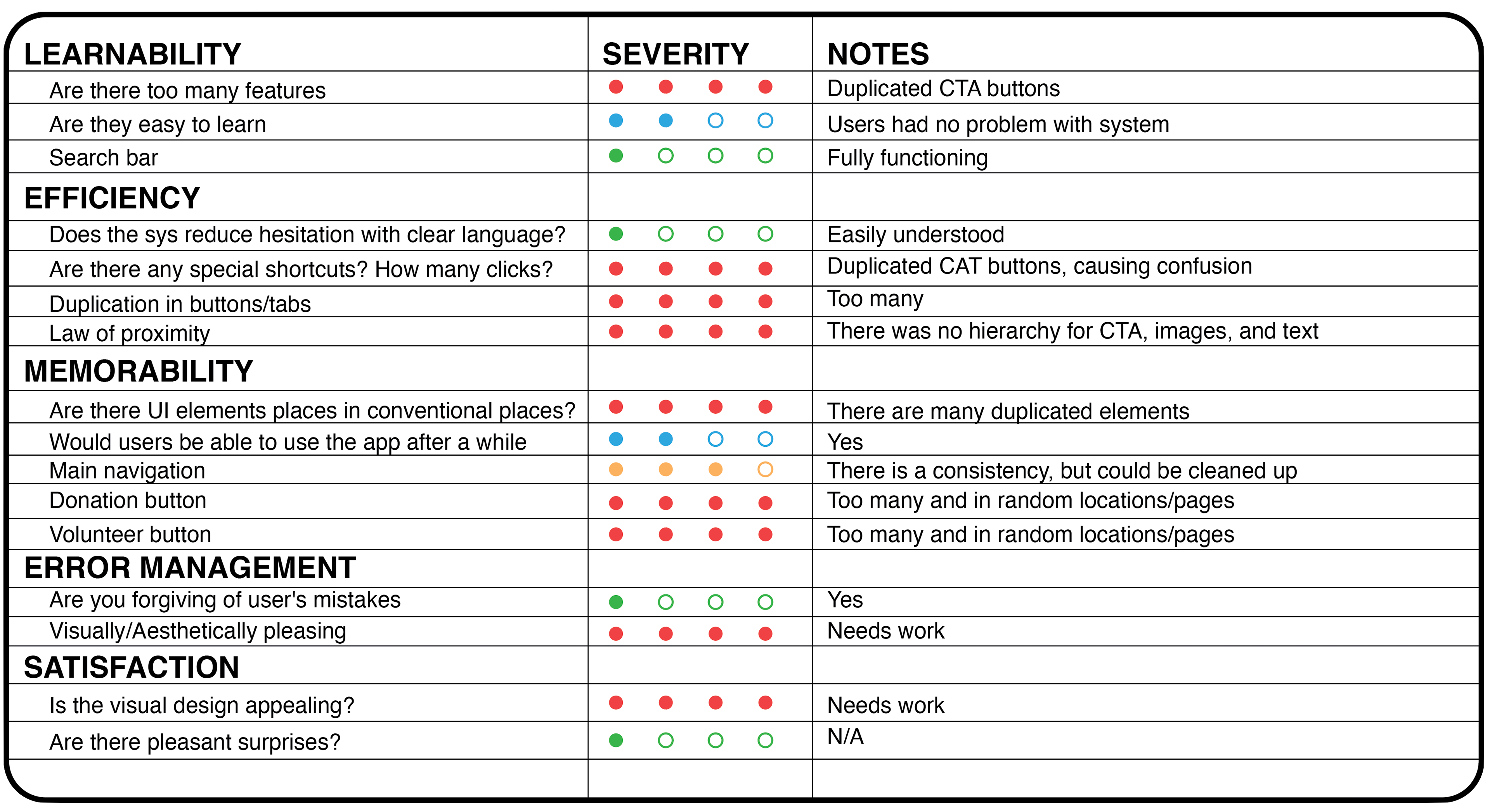
Efficiency (1)
Users struggled with the volunteer sign-up and donation processes. This confusion led to a noticeable drop in sign-ups.
Solve;
• A minimal redesign to improve the health metrics
Memorability (2)
The refugee community crusader struggled with the volunteer sign-up and donation processes due to overwhelming duplicate CTA buttons and tabs. The frustration led to a negative impact on user engagement, ultimately affecting conversion rates and business outcomes.
Solve;
• An intuitive donation and volunteer experience
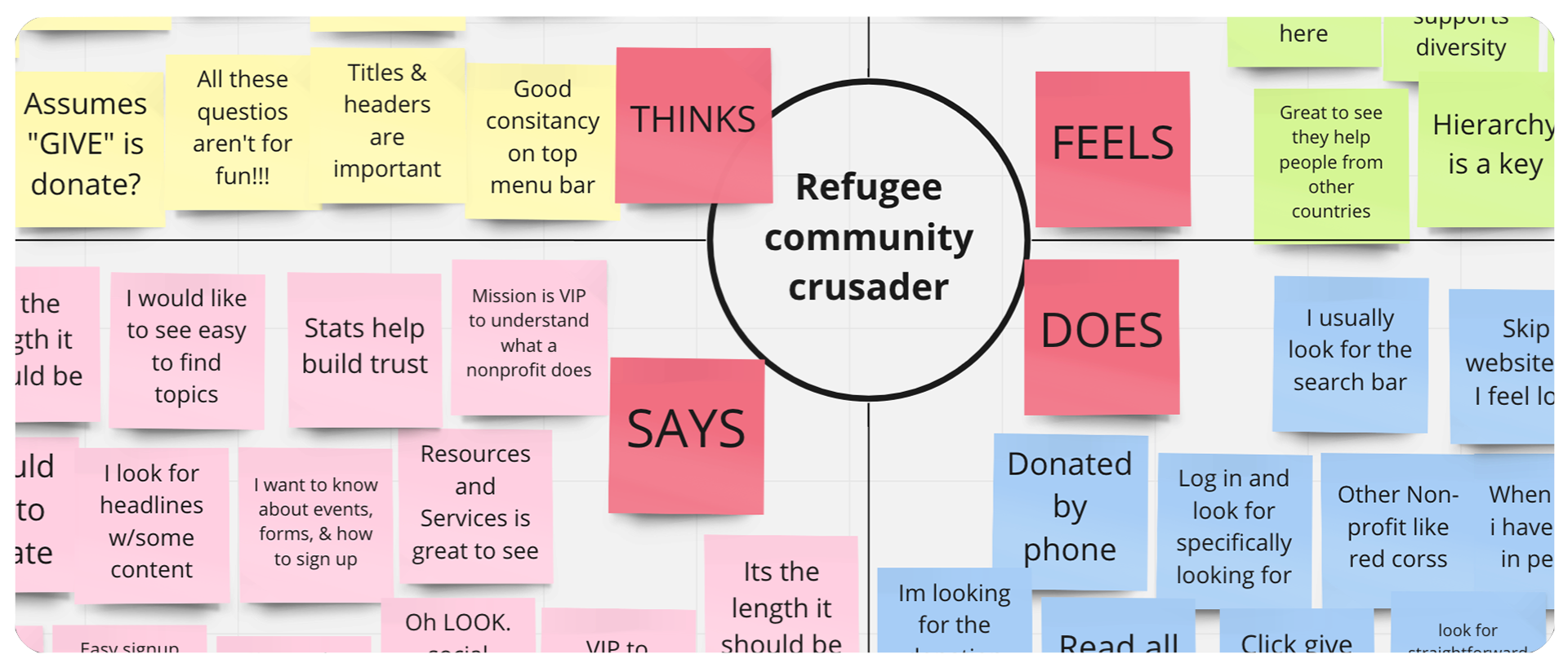
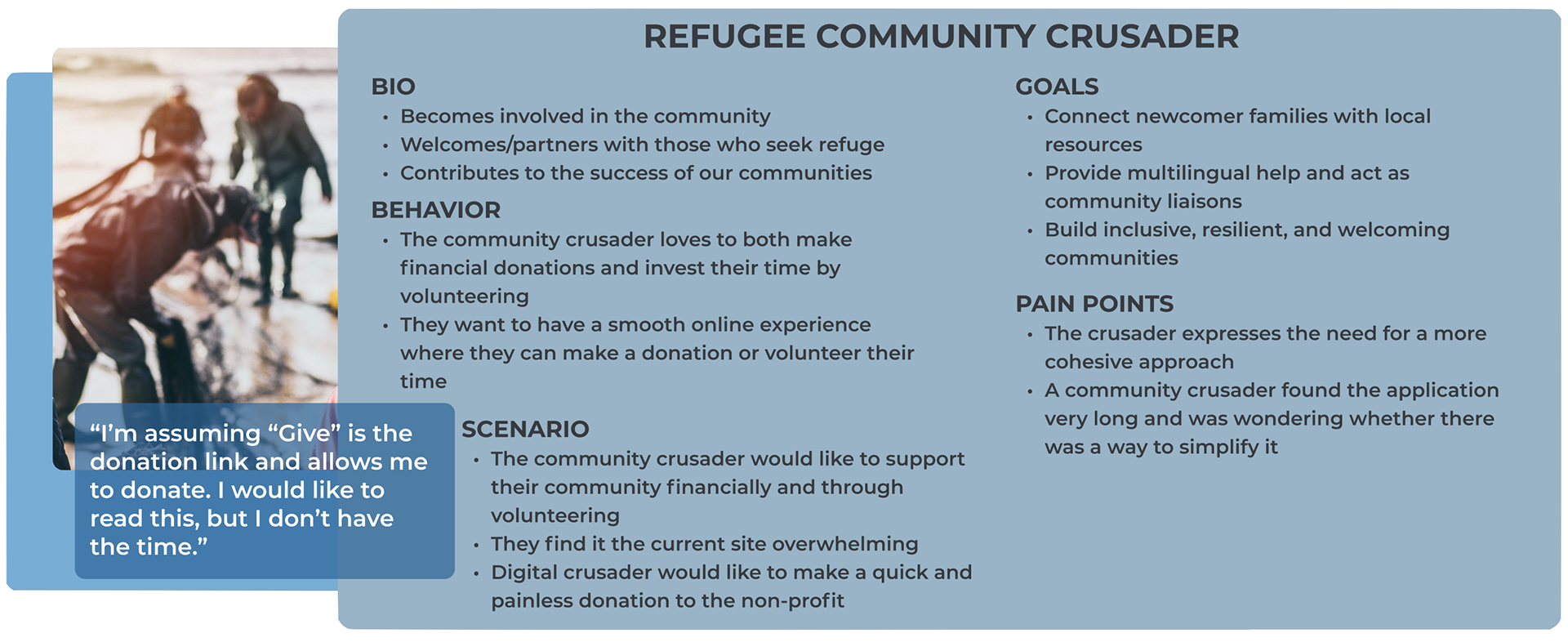
The Refugee Community Crusader
The Crusaders aimed to make a positive impact on their local non-profit. They view their contributions as an investment in the community, which drives increased donations and strengthens overall support.
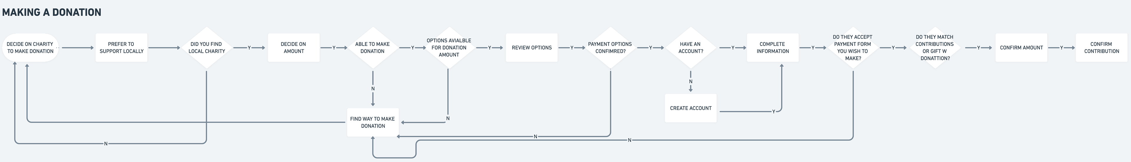
A world journey
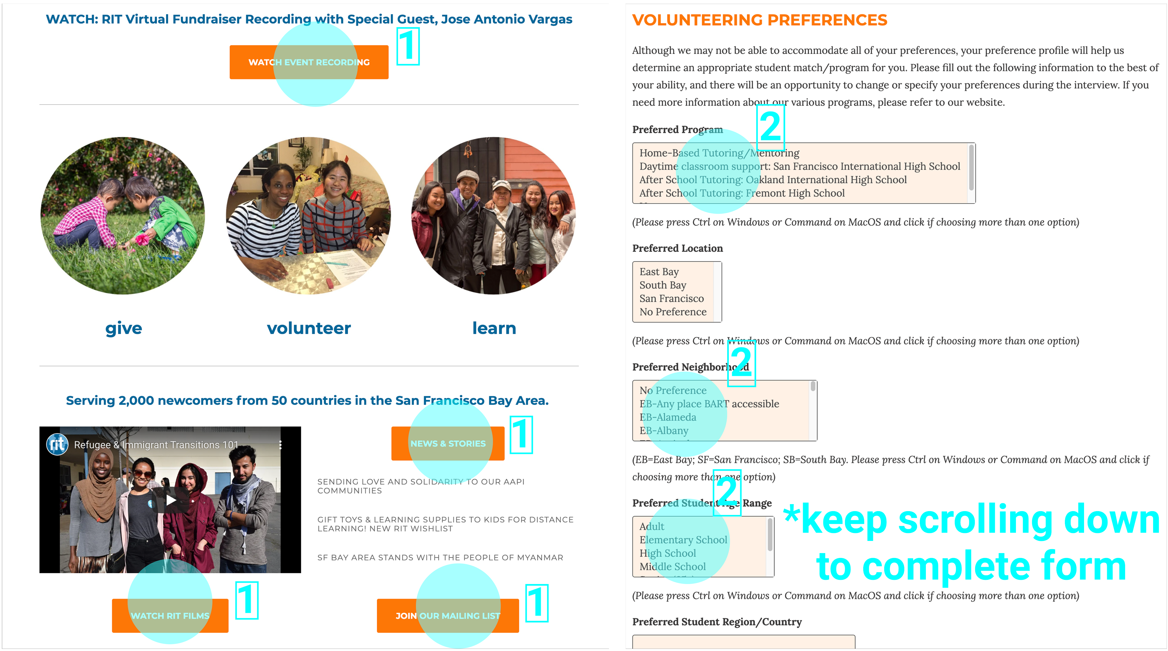
Users were overwhelmed by the excessive text and links on the sign-up page, making the application feel lengthy and burdensome. The process seemed endless, leading to a decrease in volunteer sign-ups and donations.
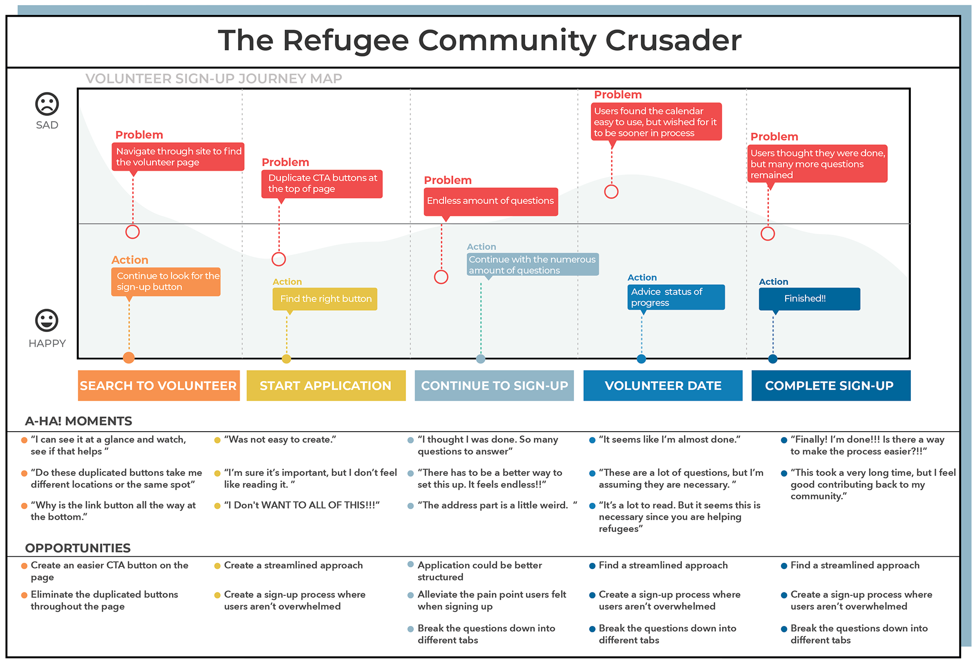
The problem...
“At this point, I would like to see where I can type in my name, I keep looking for a form.”
The Community Crusader struggled with excessive text, cluttered images, and duplicated CTA buttons. A minimal design approach was essential to improve user experience and reduce the loss of sign-ups.
Donation forms were simple to use, but the volunteer sign-up page was overwhelming. The duplicated CTA buttons made it difficult for the crusader to prioritize. This resulted in a negative impact on donation amounts and volunteer sign-ups.
The hypothesis...
Proposed updates;
• The use of color to indicate the level of importance
• Simplify and streamline the donation process for ease of use
• Create a smoother, more intuitive volunteer sign-up experience
How's the foundation architecture?
“There’s a need to re-shift things around- give me the content I need to know about.”
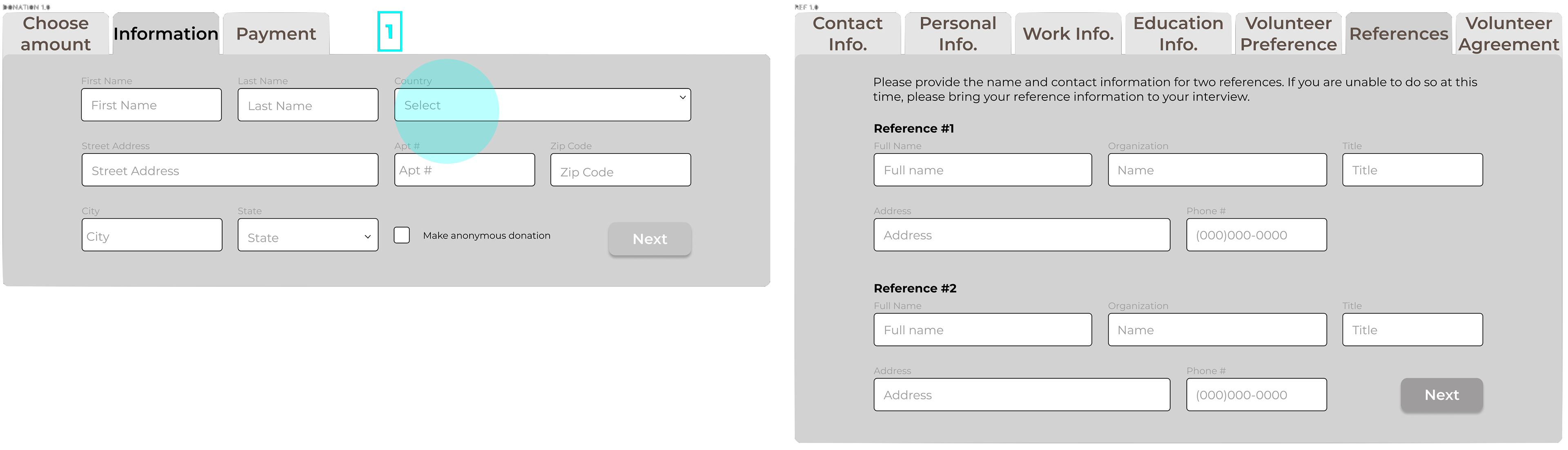
Card sorting helped simplify the information architecture, resulting in a more intuitive layout. The client requested that "RIT at a glance" be its separate link, improving clarity and enhancing the overall user experience.
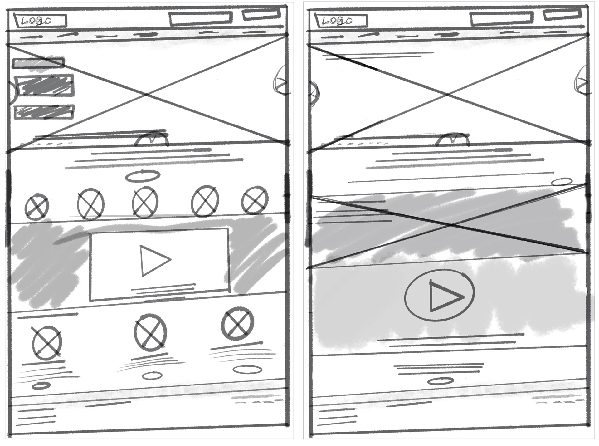
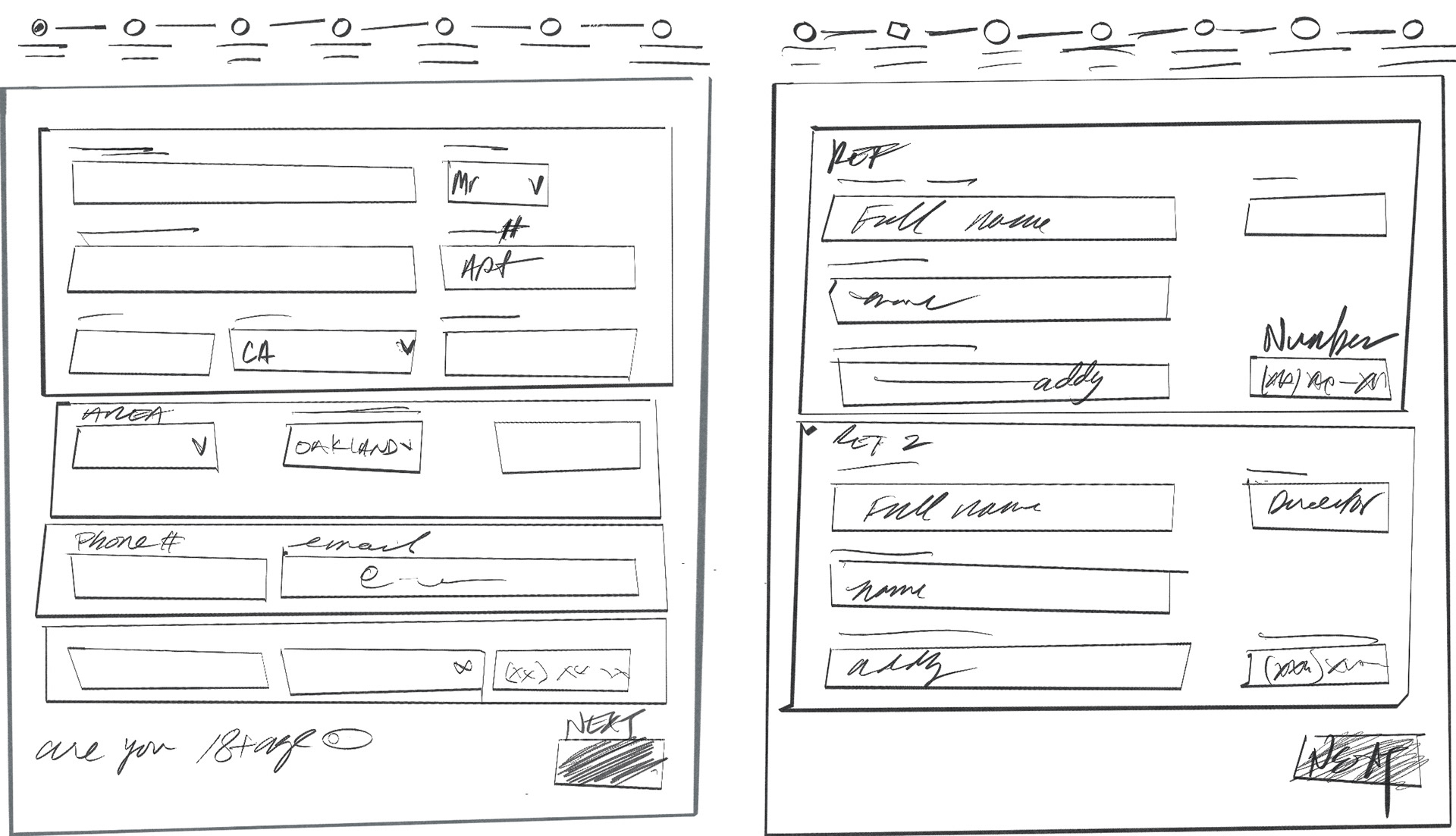
Pen to paper
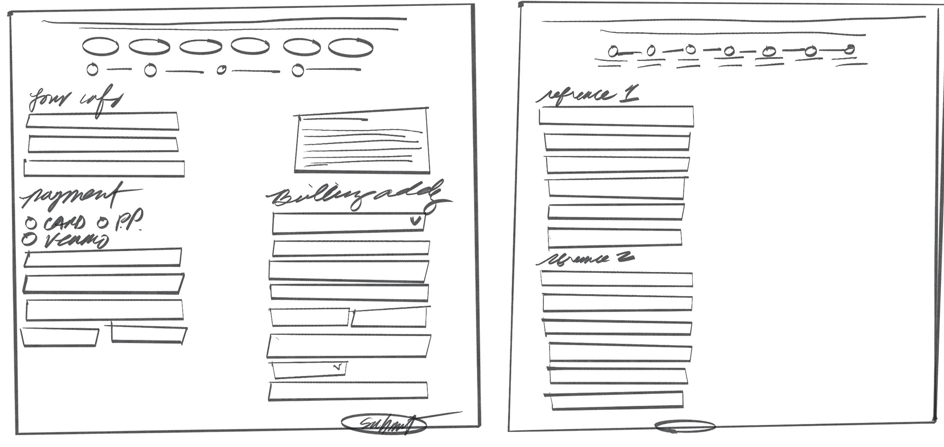
We tested low-fidelity frames with users. This led to a simplified, more effective design based on user preferences.
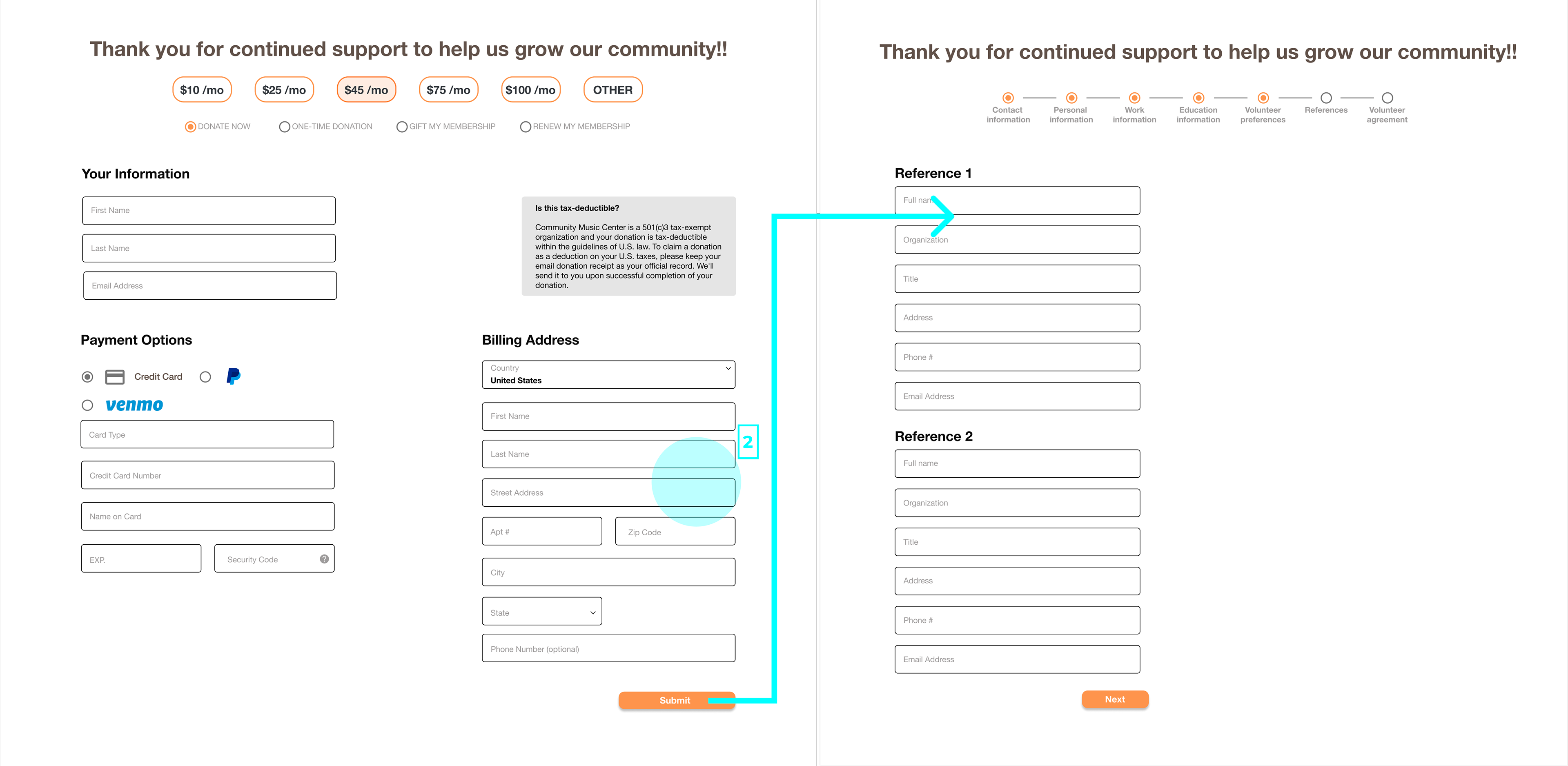
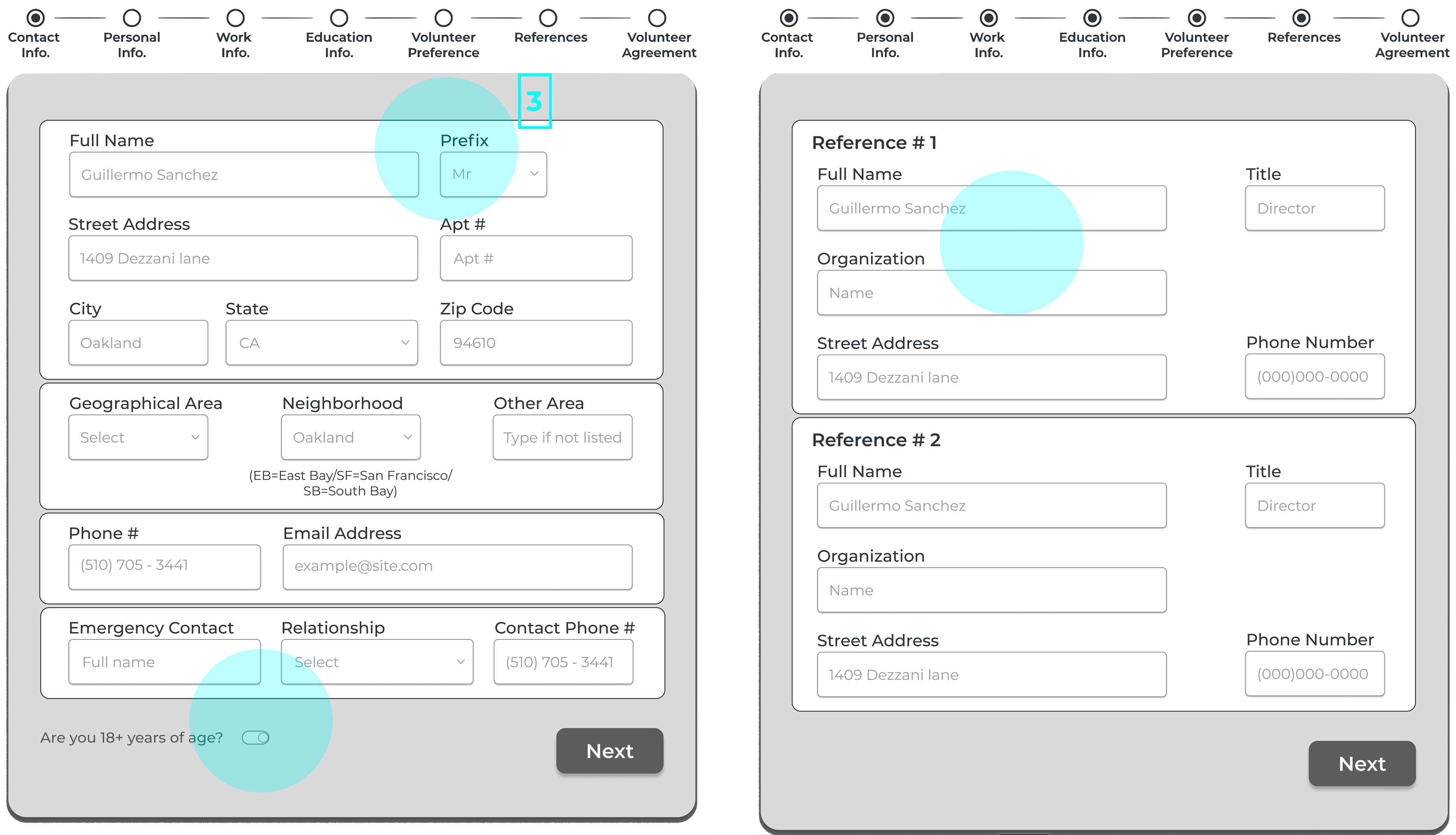
Iterate based on users' needs
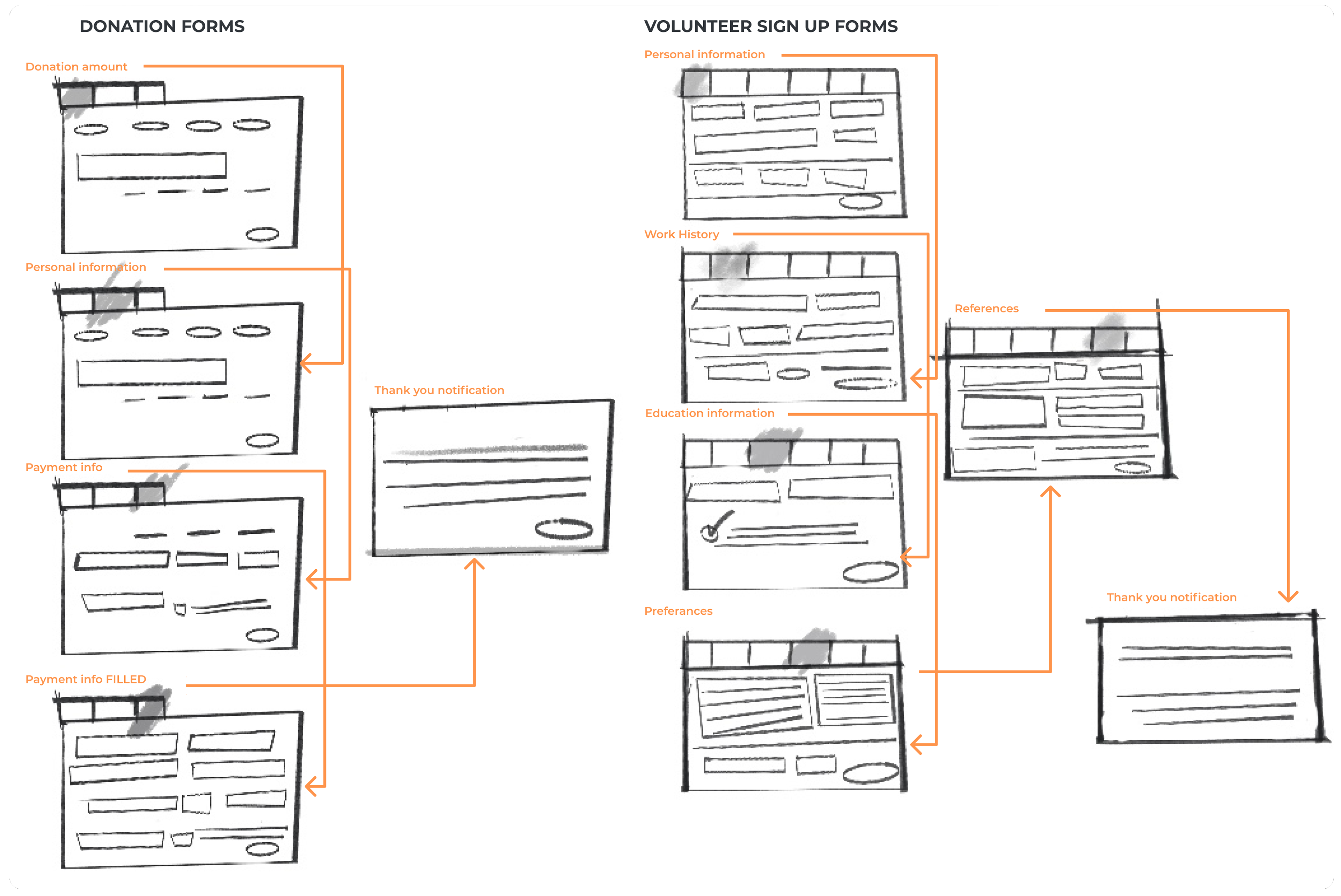
Testing revealed abandonment due to cognitive overload. We implemented a tabbed interface to segment required fields, while preserving essential data collection, resulting in 2.5x more qualified volunteer conversions.
Before committing to high-fidelity
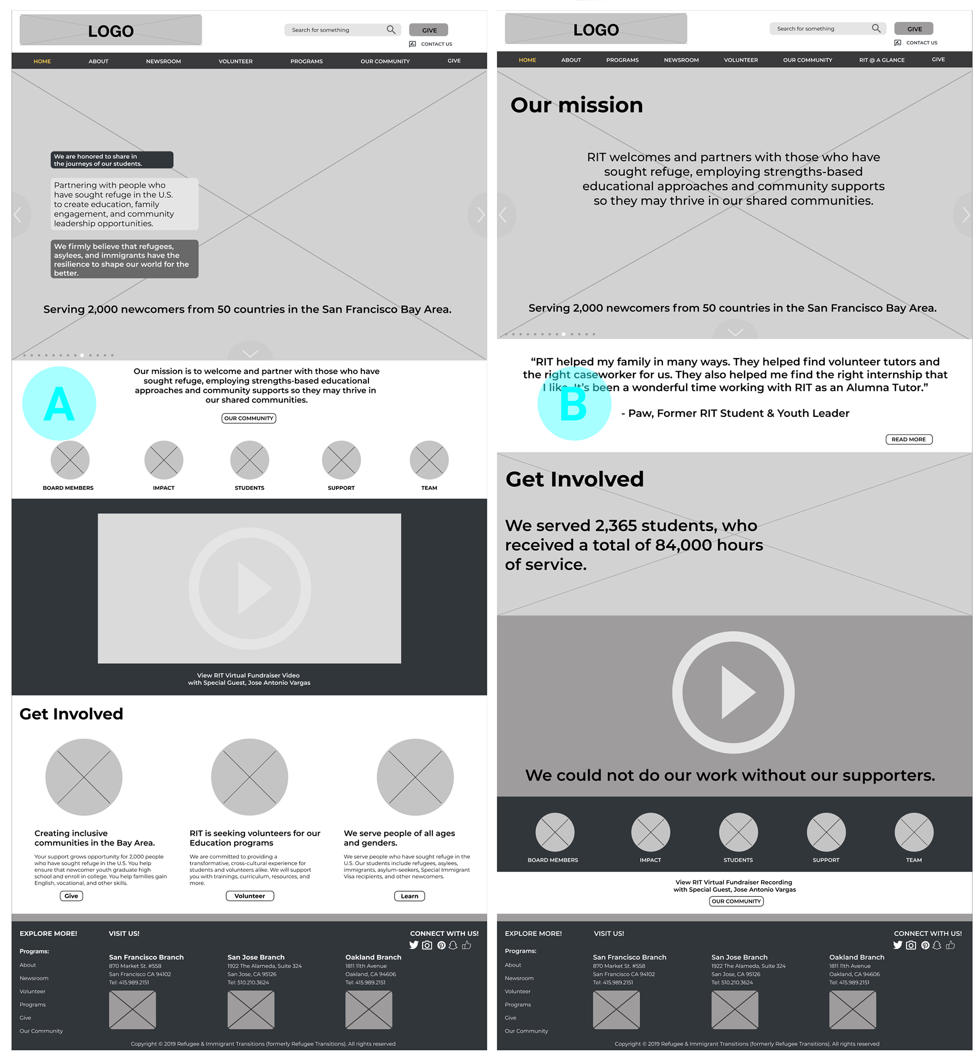
“I think B does a better job presenting the important information.”
Testing validated our redesign approach, showing a 37% lift in conversion. While stakeholders advocated for maintaining legacy design patterns, user research demonstrated the new interface drove 3x higher engagement and 28% faster task completion.
The results are in
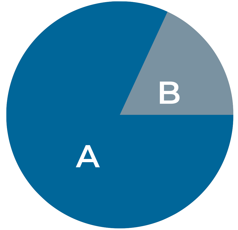
Testing led to 80% in favor of option "B", where “A” tested at 8%.
(2)
(3)
"The filing system" (1)
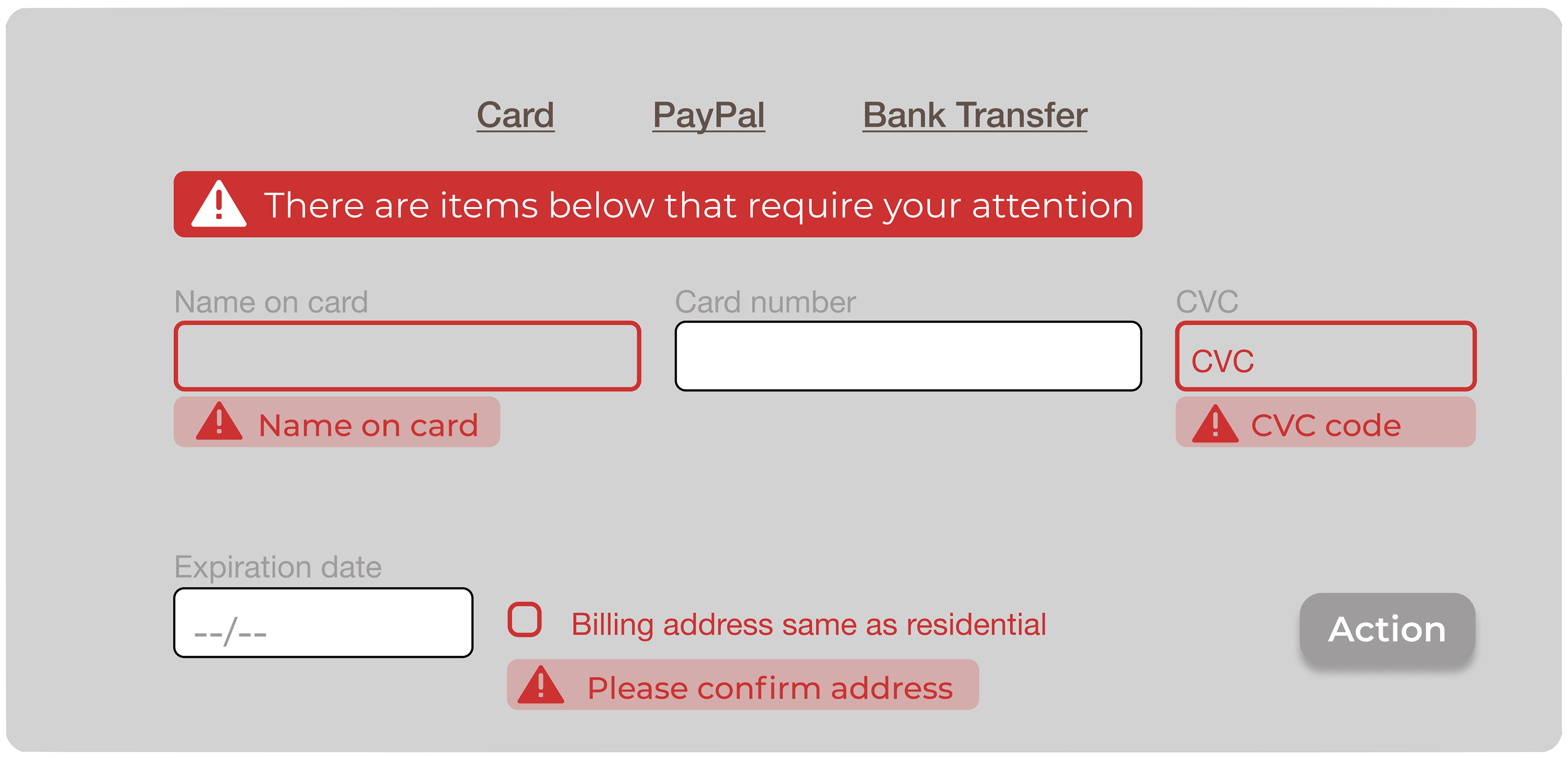
• Complex multi-select interfaces drove 53% form abandonment - dropdown menus increased completion by 31%
• Lack of progress indicators caused 72% of users to abandon before final submission - implementing step tracking lifted conversion by 45%
• Missing validation and back navigation led to 89% of users abandoning after errors - adding inline validation and clear progress paths doubled form completion rates
"What should I focus on?"
We'll call this guy "The Picture Show" (2)
• Slow load time due to large images
• Testers struggled with prioritizing content
“I’d like to see how you worked through all the options.”
Last but not least, "The featured attraction" (3)
• The final design balanced images and text effectively.
• Users could easily access relevant information.
The journey is complete
“It seems this is necessary since you are helping refugees.”
Final testing revealed there was a consistent drop in completion. While the improved navigation increased engagement by 45%, participants reported form fatigue by citing the length of questions. We optimized the required field layout while maintaining comprehensive data, resulting in a 27% increase in completed applications.
View the prototype
Through data-driven analysis, we prioritized two revenue-critical MVPs:
• Optimized donation flow reduced friction by 40%, driving a 52% increase in completed transactions
• Streamlining the volunteer registration improved completion rates by 63%
Next steps
A standardized error messaging system across both donation and registration forms would reduce user drop-offs.
Reflections
My teammate and I are both immigrants. We felt that this was our opportunity to give back to the community!!!
We leveraged our unique personal perspective to the project. Our data-driven redesign increased donor engagement by 52% while maintaining brand consistency. Through collaborative iteration with stakeholders, we balanced proven user research with client requirements, resulting in a 63% increase in volunteer registration and 52% higher donation completion.
Updates:
• Landing page
• Donation process
• Volunteer sign-up